The post Unlock Up to 23% Higher Revenue: The ROI of Branding and Design You Can’t Ignore appeared first on Ikonik Digital Agency | Digital Marketing & Web Development Agency | Jamaica.
]]>How Investing in Branding Can Boost Your Bottom Line
In today’s fast-paced business world, standing out is more important than ever. For businesses—whether new startups or established enterprises—branding is one of the most powerful ways to differentiate yourself from competitors. It’s not just about a logo or color palette, but rather an all-encompassing experience that influences how your customers perceive your company, products, and services. A well-executed brand strategy goes beyond aesthetics—it can be a revenue-generating asset that drives customer loyalty, increases sales, and positions your business for long-term success.
In this post, we’ll dive deep into why investing in branding is a crucial step toward building a lasting and successful business. We’ll explore how branding drives ROI (Return on Investment), using compelling statistics, real-life examples, and actionable insights to highlight the immense value of a strong brand identity.
What Is Branding?
Before we explore the ROI of branding, it’s important to define what branding actually is. Branding goes far beyond a company’s logo—it’s the entire identity and experience that your business offers to the customer. It encompasses a wide range of elements, including:
- Logo and Visual Identity: The visual aspects of your brand such as colors, typography, and imagery. This is what people first notice about your brand.
- Brand Voice and Messaging: The tone, language, and values you communicate through your marketing, customer service, and other interactions.
- Customer Experience: How customers feel when interacting with your brand, whether through your website, social media, or in person.
- Consistency Across Platforms: Maintaining a uniform message across all platforms, whether it’s your website, email newsletters, or social media.
- Emotional Connections with Customers: Branding aims to create lasting emotional bonds with your audience, fostering loyalty and trust.
Ultimately, branding is how your audience perceives your business. A cohesive and strong brand identity fosters trust, builds recognition, and attracts customers. Now let’s explore why investing in a powerful brand is essential for business growth.
Why Branding Matters: The Business Case for Investing in Design
The ROI of branding isn’t always immediately visible, but it is certainly significant. By investing in quality branding, businesses can unlock multiple benefits that directly affect the bottom line. Let’s explore some of the key reasons why branding matters and why it should be viewed as an investment, not an expense.
1. Brand Consistency Builds Trust and Loyalty
One of the most powerful reasons to invest in branding is that it creates consistency. Consistent branding across all platforms—whether it’s your website, social media, or even packaging—builds trust and creates a stronger emotional connection with customers. Consumers are more likely to trust brands that are clear and professional in their messaging.
Statistical Insight: According to a study by Lucidpress, consistent branding across all platforms can increase revenue by as much as 23%. When customers see a unified message, whether they’re browsing your website or scrolling through social media, they feel more confident in your brand. This leads to increased customer loyalty and repeat business.
When your branding is consistent, it fosters trust, and loyal customers are more likely to refer your business to others. This word-of-mouth advertising is free and can significantly boost your customer base.
2. Strong Branding Increases Perceived Value
Branding doesn’t just improve how your business looks—it can elevate the perceived value of your products and services. A well-crafted brand identity positions your company as premium, even in competitive markets. When done right, branding makes your business appear more sophisticated, professional, and reliable.
Case Study: Take Apple, for example. The company’s minimalist design approach and consistent branding message have made it one of the most valuable brands globally. Their products often command higher prices compared to competitors, even when the specifications may be similar. This is a result of the powerful brand they’ve built.
Investing in quality branding and design allows businesses to position themselves as industry leaders, even if they don’t have the lowest-cost products. This strategy can enable businesses to charge premium prices while fostering customer loyalty.
3. Effective Branding Drives Customer Engagement
Customer engagement is at the heart of any successful brand strategy. When customers feel emotionally connected to a brand, they’re more likely to interact with it, share content, and even advocate for it. Strong branding helps create that emotional connection.
Statistical Insight: According to Forbes, brands with a strong emotional connection to consumers see 2x higher customer loyalty and revenue growth than those without. Customers who feel a bond with your brand are more likely to engage with your business on social media, subscribe to newsletters, and participate in other forms of engagement.
The more emotionally connected your customers are to your brand, the more they will engage with it, and the more your business will grow. Effective branding makes it easy for customers to see the value your brand offers and encourages them to stick around for the long haul.
4. Branding Improves Market Differentiation
In crowded markets, differentiation is key. A strong brand identity helps your business stand out and communicate what makes it different from competitors. Effective branding clearly defines your unique value proposition (UVP), helping customers easily understand why your business is the best choice for their needs.
Case Study: Nike is a great example of a brand that effectively differentiates itself. Their iconic “swoosh” logo and the famous “Just Do It” slogan immediately communicate empowerment and athleticism. This clarity and consistency in their messaging have helped Nike dominate the sportswear market, making it a household name.
By developing a strong and unique brand identity, businesses can make it clear what sets them apart, helping customers understand why they should choose you over competitors.
5. Branding Drives Sales and Profitability
A well-established, memorable brand can have a significant impact on sales. Companies with strong branding experience higher customer retention, better conversion rates, and greater overall profitability.
Statistical Insight: According to Havas Media, 74% of consumers are more likely to buy from a brand they trust and feel connected to. A solid brand identity creates trust, and when customers trust your business, they are more likely to make purchases and recommend you to others.
Case Study: Coca-Cola’s branding is a prime example of how branding drives sales. For decades, Coca-Cola has invested in building an emotional connection with its customers through consistent messaging, storytelling, and visual design. As a result, the company has remained one of the most profitable brands in the world.
Branding not only improves your visibility but also influences purchasing decisions, turning prospects into loyal customers who keep coming back for more.
Measuring the ROI of Branding
Now that we’ve established why branding is so valuable, let’s take a look at how you can measure the ROI of your branding efforts. Understanding how branding impacts your business’s bottom line can help justify the investment and track the results.
1. Brand Awareness
Brand awareness is one of the first indicators that your branding efforts are working. This can be measured through metrics like website traffic, social media mentions, and search volume related to your brand. Tools like Google Analytics, social listening platforms, and surveys can help track these metrics and measure how effective your brand awareness campaigns are.
2. Customer Retention Rates
Branding plays a critical role in building customer loyalty. Tracking how often customers return to make purchases can give you an indication of how successful your branding efforts are. If your branding resonates with customers, they’ll keep coming back.
3. Sales Growth
Monitor your sales before and after a branding update or rebranding project. A noticeable uptick in sales can often be attributed to the increased brand recognition and customer loyalty fostered by your branding.
4. Engagement Metrics
High engagement levels on your website and social media platforms are another good sign that your branding is hitting the mark. Metrics like click-through rates, social shares, and comments can help you understand how effectively your brand is engaging with your target audience.
Conclusion: Branding Is an Investment, Not an Expense
In conclusion, the ROI of branding is clear. Strong, consistent branding doesn’t just help you look good—it can increase customer trust, boost sales, drive customer engagement, and differentiate your business in the marketplace. Far from being an expense, branding is a powerful investment that pays off in tangible ways.
If you’re ready to invest in your brand and unlock the immense potential it holds for your business, Ikonik Digital is here to help. Our team of experts specializes in crafting powerful, memorable brands that resonate with your customers and drive measurable results. Reach out today to discuss how we can help you take your branding to the next level.
For more information or to get started, contact us at [email protected]. Let’s make your brand the next big success story!
The post Unlock Up to 23% Higher Revenue: The ROI of Branding and Design You Can’t Ignore appeared first on Ikonik Digital Agency | Digital Marketing & Web Development Agency | Jamaica.
]]>The post Consistent Branding Increases Revenue by 33%—Here’s How to Get It Right appeared first on Ikonik Digital Agency | Digital Marketing & Web Development Agency | Jamaica.
]]>The Power of a Strong Visual Identity: How Logos, Typography, and Imagery Shape Your Brand
Creating a memorable visual identity is essential for any business looking to stand out in a crowded marketplace. Whether you’re launching a new startup or refreshing an established brand, the visual elements of your company—like your logo, typography, and imagery—are what distinguish you from competitors, connect you with your audience, and leave a lasting impression.
In this blog post, we’ll dive into the three key pillars of a strong visual identity: logos, typography, and consistent imagery. By the end of this article, you’ll have a deeper understanding of how to use these elements to create a powerful, recognizable brand that resonates with your audience.
1. Crafting a Memorable Logo
Your logo is the first thing people notice about your brand. It’s the cornerstone of your visual identity and the symbol that represents everything your business stands for. A well-designed logo is not just a pretty image; it’s a visual shorthand for your company’s values and purpose.
Why a Logo Matters
First Impressions Count
A logo is often the first interaction your audience has with your brand. It needs to make a positive impact immediately. A well-crafted logo gives potential customers a glimpse of what your business is about. It’s your brand’s first impression, so make it count!
Brand Consistency
Your logo should appear consistently across all platforms—website, social media, packaging, and advertisements. This consistency strengthens brand recognition and fosters trust. Your audience begins to recognize your brand at a glance, and familiarity breeds loyalty.
Memorability
Think of iconic brands like Nike and Apple. Their logos are simple, timeless, and easily recognizable. Your goal is to create a logo that is equally memorable, ensuring customers immediately associate it with your company.
Tips for Designing a Strong Logo
- Keep it Simple
Simplicity is key in logo design. A clean, uncluttered logo is easy to remember and versatile. Avoid overcomplicating things with too many details. - Ensure Versatility
Your logo should look great in various sizes, from tiny social media icons to large billboards. It should also look good in both color and black-and-white versions. - Reflect Your Brand’s Values
Your logo should be an authentic reflection of your company’s personality and values. Consider your target audience and your industry when selecting design elements. - Choose the Right Colors
Color plays a significant role in branding. Different colors evoke different emotions. For example, blue exudes trust and professionalism, while yellow conveys optimism and energy. Choose colors that resonate with your brand’s message.
2. Typography: The Power of Fonts
When it comes to typography, it’s not just about choosing fonts for readability—it’s about conveying your brand’s personality. The fonts you select help set the tone for your entire business.
Why Typography Matters
Consistency is Key
Just as with logos, consistency in typography is crucial. Using the same fonts across all your marketing materials—from your website to social media—creates a cohesive, professional appearance.
Sets the Tone
The right font can dramatically impact the tone of your brand. A sleek, modern sans-serif font may communicate innovation and professionalism, while a classic serif font might evoke tradition and sophistication.
Improves Readability
Choosing readable fonts is crucial for user experience. Whether it’s on your website, in an email, or on a flyer, your audience needs to quickly absorb your messaging without straining their eyes.
Tips for Choosing the Right Typography
- Limit Font Choices
Stick to 2-3 primary fonts to maintain a clean, organized look. Typically, using a bold font for headings and a more neutral font for body text works well. - Make Sure It’s Legible
Fonts should be easy to read on all devices and across various platforms. Avoid overly decorative fonts that could make your text hard to decipher, especially on mobile. - Consider Your Brand Personality
Your fonts should align with your brand’s voice. For example, a legal firm may opt for a more formal serif font, while a tech startup might choose a clean, sans-serif font. - Ensure Web Compatibility
Make sure your fonts are web-safe and compatible with all browsers and devices. Tools like Google Fonts provide a wide range of free, high-quality options.
3. Consistent Imagery: Telling Your Brand Story Visually
Images are an incredibly powerful tool for storytelling. Whether you use photos, illustrations, or icons, the imagery you select can significantly impact how your audience perceives and connects with your brand.
Why Consistent Imagery Matters
Sets the Mood and Tone
Images are emotional. They help set the mood and convey the feelings you want your audience to experience when they interact with your brand. Whether it’s joy, trust, or inspiration, the right images speak volumes.
Strengthens Brand Identity
Consistent imagery creates a cohesive look across all your marketing materials. This consistency helps build brand recognition and makes your business instantly recognizable.
Builds Trust
High-quality, on-brand imagery elevates your company’s professionalism and authenticity. Using generic stock photos that don’t reflect your brand’s style can hurt your credibility.
Tips for Using Imagery Consistently
- Establish a Visual Style Guide
A visual style guide outlines the types of images that align with your brand’s message. Include color palettes, image types, and even guidelines for image placement. This will ensure that all visuals are on-brand and cohesive. - Use Authentic Photography
Whenever possible, opt for custom or original photography. Authentic, real-life images resonate more with your audience than generic stock photos. - Be Mindful of Colors
Just like your logo, your imagery should reflect your brand’s color palette. Consistent use of these colors across your images reinforces brand identity and makes your brand more recognizable. - Consider Image Composition
Ensure that your images follow a consistent visual style. This could mean using similar framing, filters, or composition across your photos. Visual harmony strengthens your brand’s overall look.
Putting It All Together: Creating a Unified Brand Identity
The strength of your visual identity lies in its consistency. Your logo, typography, and imagery should work together seamlessly to communicate your brand’s values and message. When these elements align, they create a unified brand presence that resonates with your audience and builds trust.
How to Build Your Visual Identity
- Start with Your Brand’s Core Values
Understand what your brand stands for, who your target audience is, and the message you want to convey. This foundation will guide your decisions regarding your logo, typography, and imagery. - Create a Style Guide
Document your brand’s visual elements in a style guide. This should include specifications for your logo, color palette, fonts, imagery guidelines, and any other visual components of your brand. A clear style guide ensures consistency across all touchpoints. - Apply Consistently Across Channels
Once you’ve defined your visual identity, ensure that it’s applied consistently across all marketing channels. From your website to social media, email campaigns, and packaging, consistency builds brand recognition and trust.
Conclusion: Build a Brand That Stands Out
A strong visual identity is more than just aesthetic appeal—it’s the foundation of your brand’s personality and values. By focusing on the key elements of logos, typography, and consistent imagery, you can create a cohesive and recognizable brand that resonates with your audience and stands the test of time.
At Ikonik Digital, we specialize in helping businesses build visual identities that capture attention and leave a lasting impression. If you’re ready to refine or create your brand’s visual identity, we’re here to help. Reach out to us today at [email protected] for strategy discussions, branding advice, or to start creating a powerful visual identity that sets you apart from the competition.
The post Consistent Branding Increases Revenue by 33%—Here’s How to Get It Right appeared first on Ikonik Digital Agency | Digital Marketing & Web Development Agency | Jamaica.
]]>The post Unlock Brand Power: The Case for Quality Graphic Design That Converts appeared first on Ikonik Digital Agency | Digital Marketing & Web Development Agency | Jamaica.
]]>The Power of Quality Over Quantity in Graphic Design: Why Less is Often More
In the fast-paced world of graphic design, it’s easy to get carried away with the idea that more is better. More elements, more colors, more fonts, more complexity—it might seem like the more you include, the more you have to offer. But in reality, the opposite is true: quality over quantity is the key to creating powerful, impactful, and memorable designs.
As business owners and corporate executives, you understand the importance of standing out in a crowded marketplace. Graphic design plays a pivotal role in shaping your brand’s identity, communication, and overall success. But how do you ensure that your design is working for you, not against you? In this post, we’ll explore why prioritizing quality over quantity is crucial in graphic design. From streamlining your design elements to ensuring your message is clear and consistent, let’s delve into the power of simplicity and how focusing on less can lead to greater impact.
1. Clarity and Focus: Less is More
One of the biggest mistakes in graphic design is overcrowding. It’s tempting to add more elements, more colors, and more fonts to make a design feel “full.” However, this often results in visual clutter that distracts from the core message. When too many elements compete for attention, your audience may struggle to understand what’s most important.
Why Quality Matters:
When you focus on fewer, high-quality design elements, the message becomes clearer and more accessible. This enables your audience to concentrate on the most essential information without distractions. A simple, well-thought-out design communicates professionalism and clarity, leaving a lasting impression.
Example: Think about the iconic Nike Swoosh or Apple’s apple logo. These designs are simple, yet powerful. Their minimalism makes them instantly recognizable and easy to remember.
Pro Tip for Business Owners: Simplifying your designs doesn’t mean sacrificing creativity. Instead, aim to craft designs that communicate your core message with elegance. Clean, focused visuals help your audience quickly grasp your brand’s purpose and message.
2. Brand Consistency: Quality Builds Trust
Another common mistake in design is inconsistency. Overusing different styles, colors, or fonts across your brand’s visual materials can confuse your audience. It’s vital to create a cohesive look across all platforms to ensure that your brand is recognizable and trustworthy.
Why Quality Matters:
When you focus on quality, you’re also focusing on consistency. Consistently using the same colors, fonts, and imagery reinforces your brand identity. This builds trust with your audience, as it creates a unified experience across all touchpoints—whether on your website, social media profiles, or advertisements.
Example: Brands like Coca-Cola and McDonald’s have mastered brand consistency. They use the same design elements across all platforms, making them instantly recognizable and building customer confidence in their professionalism and reliability.
Pro Tip for Business Owners: Consistency is key to building a strong brand identity. Ensure that all your design materials—whether print or digital—follow the same visual guidelines to foster trust and recognition among your audience.
3. Impactful Design: Quality Leaves a Lasting Impression
Trying to fit too much into a design often leads to visual chaos, where no single element stands out. It becomes challenging to convey a strong message when everything seems equally important. Without focus, your design loses its impact.
Why Quality Matters:
A well-executed, high-quality design leaves a lasting impression. By focusing on one or two key visual elements, you create a design that stands out. This simplicity helps communicate your message clearly and makes the design more memorable. The human brain processes visuals quickly, and impactful designs—those that are clean, clear, and direct—are more likely to evoke an emotional connection with your audience.
Example: The I  NY logo is a prime example of impactful design. It’s simple yet incredibly powerful. The combination of text and the heart symbol conveys the essence of New York in just three characters, making it emotionally resonant and unforgettable.
Pro Tip for Business Owners: Focus on one or two strong elements in your design that capture the essence of your message. Whether it’s a bold headline or a striking image, make sure your design stands out without overwhelming the viewer.
4. Functionality and Usability: Quality Enhances User Experience
A visually appealing design might grab attention, but if it doesn’t prioritize usability, it won’t be effective. Overloading a design with unnecessary details can distract from its core purpose—whether that’s to drive sales, inform, or prompt action.
Why Quality Matters:
Great graphic design is about more than just aesthetics; it’s about creating designs that work. The best designs are those that enhance usability. Simple, high-quality elements aligned with the user’s needs will always outperform flashy, over-complicated visuals. When a design enhances usability—through intuitive navigation, clear typography, or a well-structured layout—it ultimately supports your business goals.
Example: Many modern websites, including Apple’s, adopt minimalist designs that enhance usability. Clean, intuitive navigation allows users to find what they need without distraction.
Pro Tip for Business Owners: When designing for a website or app, ensure that functionality takes precedence. Keep the layout simple, and prioritize ease of use. Remember, your design should guide users toward action, not distract them from it.
5. Emotional Connection: Quality Evokes the Right Feelings
One of the most important aspects of design is its ability to create an emotional connection with the audience. However, when you overload a design with too many elements, it’s difficult to control the emotional response it triggers. The message may get lost, and the audience may feel indifferent.
Why Quality Matters:
A high-quality design can evoke a strong emotional response. Through careful selection of colors, fonts, and images, you can communicate the mood, personality, and values of your brand. Emotional connections play a critical role in consumer behavior—people are more likely to engage with and remember a brand that resonates with them on an emotional level.
Example: The Nike Just Do It campaign uses powerful imagery and minimal text to communicate empowerment and determination. The simplicity of the design resonates deeply with their audience, driving engagement and brand loyalty.
Pro Tip for Business Owners: Use your design to evoke emotions that align with your brand’s core values. A design that connects emotionally with your audience is more likely to inspire action and build lasting relationships.
6. Scalability and Adaptability: Quality Lasts
As businesses grow, their designs need to scale across multiple platforms. Overcomplicating designs can make them hard to adapt, reducing their effectiveness across different formats and media.
Why Quality Matters:
High-quality design elements are versatile and adaptable. Whether it’s a logo that works across business cards and billboards or an ad that performs well on both Facebook and Instagram, a well-designed piece can scale up or down without losing its impact. High-quality designs work seamlessly across various mediums, ensuring your brand remains effective no matter where it’s displayed.
Example: The Google logo is an excellent example of a design that scales beautifully. Whether it’s displayed on a desktop screen, mobile app, or even a search bar, the design retains its clarity and effectiveness across all platforms.
Pro Tip for Business Owners: As your business grows, ensure your design elements are scalable. A high-quality logo or visual style should look great whether it’s seen in a small social media post or on a large billboard.
7. The Power of Focused Storytelling
Design is a powerful tool for storytelling. However, when you attempt to communicate too many messages at once, your story becomes diluted. Too many elements can leave your audience confused about what action to take or what message to focus on.
Why Quality Matters:
Effective design is all about focused storytelling. Every element in your design should serve a purpose and contribute to the larger narrative. Whether it’s a logo, website, or marketing campaign, your design should guide the viewer’s eyes and lead them to the most important message you want to convey.
Example: The World Wildlife Fund (WWF) panda logo is a simple, iconic design that tells a powerful story about wildlife conservation. Its simplicity helps viewers immediately understand the message and connect emotionally with the cause.
Pro Tip for Business Owners: Craft your design to tell a clear, focused story. Ensure each element contributes to the larger narrative, guiding your audience toward the message or action you want them to take.
Conclusion: Embrace Quality, Not Quantity
In graphic design, the saying “less is more” couldn’t be truer. By focusing on quality over quantity, you can create designs that are clear, impactful, functional, and memorable. When you simplify your approach and prioritize quality elements, you enhance your brand identity, improve user experience, and leave a lasting impression on your audience.
At Ikonik Digital, we specialize in crafting high-quality designs that align with your brand’s vision and goals. If you’re ready to take your brand’s visuals to the next level, contact us today at [email protected] to discuss how we can help create a design strategy that prioritizes quality over quantity. Let’s work together to make your brand unforgettable.
The post Unlock Brand Power: The Case for Quality Graphic Design That Converts appeared first on Ikonik Digital Agency | Digital Marketing & Web Development Agency | Jamaica.
]]>The post The Top 10 Design Principles That Will Elevate Your Projects Overnight appeared first on Ikonik Digital Agency | Digital Marketing & Web Development Agency | Jamaica.
]]>The Power of Good Design: A Business Owner’s Guide to Innovation and Success
Design is much more than aesthetics; it’s a language that speaks directly to your customers. For business owners and corporate executives, understanding the principles of good design is essential to standing out in a competitive market. Why? Because design not only grabs attention but also conveys value, builds trust, and ultimately drives conversions.
Take Apple, for instance. The tech giant’s commitment to design, rooted in the philosophies of Steve Jobs and Jony Ive, has set the gold standard for innovation and simplicity. But Apple didn’t create its design principles in isolation. The legendary Dieter Rams—a German industrial designer—pioneered the ten principles of “Good Design,” which have influenced products worldwide, from toothbrushes to smartphones. Let’s dive into these principles and explore how they can elevate your business to new heights.
Why Good Design Matters
Imagine walking into a store or visiting a website. What catches your eye first? The design. It’s the initial impression that shapes how customers perceive your brand. A well-designed product or website communicates professionalism, quality, and attention to detail. Conversely, poor design can repel customers, no matter how great the product itself may be.
Consider this:
- Aesthetic Appeal: Customers are drawn to visually appealing products, whether physical goods or digital platforms.
- Enhanced Usability: Good design ensures that products are not just beautiful but also functional and user-friendly.
- Brand Differentiation: In a crowded market, design sets you apart from competitors.
According to a report by McKinsey, companies that prioritize design outperform their peers by a significant margin in revenue growth and shareholder returns. The message is clear: design isn’t just a bonus; it’s a necessity.

Dieter Rams’s 10 Principles of Good Design
Dieter Rams’s timeless principles provide a roadmap for creating exceptional products and experiences. Let’s break them down and see how they apply to modern businesses:
1. Good Design Is Innovative
Innovation is the lifeblood of good design. With rapid technological advancements, the possibilities for creative design are endless. For instance, smart home devices seamlessly combine utility and cutting-edge technology, offering users unparalleled convenience. As a business leader, ask yourself: How can I leverage new technologies to enhance my product or service?
2. Good Design Makes a Product Useful
Every product exists to fulfill a purpose. Whether it’s a smartphone that simplifies communication or an app that streamlines project management, utility is key. Remove any elements that distract from the core functionality. For example, a minimalist interface in software design can make tools easier to navigate, enhancing user satisfaction.
3. Good Design Is Aesthetic
A product’s visual appeal directly influences its perceived value. Think about luxury brands like Tesla or Rolex. Their designs exude elegance, creating a strong emotional connection with customers. Remember, aesthetics go beyond beauty—they’re about creating a harmonious user experience.
4. Good Design Makes a Product Understandable
Clarity is crucial. A well-designed product communicates its purpose intuitively. For instance, consider the simplicity of IKEA furniture instructions. They’re designed to guide users step-by-step, reducing frustration. How can your product or service simplify the customer journey?
5. Good Design Is Unobtrusive
Great design doesn’t shout; it whispers. It supports the user without drawing unnecessary attention to itself. For example, Google’s search engine interface is clean and unobtrusive, allowing users to focus solely on their queries.
6. Good Design Is Honest
Honesty builds trust. Avoid exaggerating your product’s capabilities. Instead, highlight its genuine strengths. A transparent approach fosters long-term customer loyalty, as seen with brands like Patagonia, which emphasize sustainability and ethical practices.
7. Good Design Is Long-Lasting
Trendy designs may capture attention briefly but often lose relevance. Timeless design endures. Consider the enduring appeal of classic Converse sneakers or Eames chairs. Invest in quality design that remains relevant for years.
8. Good Design Is Thorough Down to the Last Detail
Details matter. They’re a reflection of your commitment to excellence. Apple’s meticulous attention to packaging design, for instance, enhances the unboxing experience and sets high expectations for the product inside.
9. Good Design Is Environmentally Friendly
Sustainability is no longer optional; it’s a priority. Eco-friendly designs not only reduce waste but also resonate with environmentally conscious consumers. Brands like IKEA and Adidas are leading the way with sustainable materials and practices.
10. Good Design Is as Little Design as Possible
Simplicity is powerful. Strip away unnecessary elements to focus on what truly matters. Minimalist designs, like those of Muji or Airbnb, emphasize functionality and clarity.
Practical Applications for Business Owners
How can these principles translate into actionable strategies for your business? Let’s explore:
1. Website Design
Your website is often the first point of contact with potential customers. Apply Rams’s principles to create a website that:
- Is visually appealing: Use clean layouts and cohesive color schemes.
- Enhances usability: Ensure fast loading times, mobile responsiveness, and intuitive navigation.
- Communicates clearly: Highlight key information with concise copy and prominent calls to action (CTAs).
2. Product Development
When designing a product, keep the user’s needs at the forefront. Conduct market research to understand pain points and address them effectively. For instance:
- Usefulness: Incorporate features that genuinely add value.
- Sustainability: Opt for recyclable materials to appeal to eco-conscious buyers.
3. Branding and Marketing
Consistency in design across all touchpoints—from packaging to advertisements—reinforces brand identity. Use storytelling to connect with your audience emotionally and showcase your commitment to quality and innovation.
Overcoming Common Challenges
Many businesses struggle to integrate good design due to budget constraints, lack of expertise, or resistance to change. Here’s how to tackle these issues:
- Invest Wisely: Allocate resources to design elements that have the highest impact, such as your website or flagship product.
- Leverage Expertise: Collaborate with professional designers who understand your industry and target audience.
- Embrace Change: Stay open to feedback and continuously iterate your designs to meet evolving customer expectations.
Take the Next Step
Are you ready to elevate your business through the power of good design? By adopting Dieter Rams’s principles, you can create products and experiences that resonate with your audience and drive long-term success. Let’s make your vision a reality.
Reach out to Ikonik Digital at [email protected] for tailored strategies and expert guidance. Whether you need a website overhaul, branding support, or innovative product designs, we’re here to help. Together, we can craft solutions that not only meet but exceed your expectations.
Final Thoughts
Good design isn’t just about making things look pretty; it’s about solving problems, creating value, and building meaningful connections. As Dieter Rams wisely said, “My goal is to omit everything superfluous so that the essential is shown to best possible advantage.” Embrace this philosophy, and watch your business thrive.
The post The Top 10 Design Principles That Will Elevate Your Projects Overnight appeared first on Ikonik Digital Agency | Digital Marketing & Web Development Agency | Jamaica.
]]>The post 10 Data Visualization Tactics That Skyrocketed Bookings by 38% for Hotels & Attractions appeared first on Ikonik Digital Agency | Digital Marketing & Web Development Agency | Jamaica.
]]>The Power of Data Visualization in Hospitality Marketing: 10 Key Strategies to Drive Growth
Data visualization plays an essential role in the way businesses understand and communicate data. In the hospitality sector, particularly in marketing for hotels and attractions, using data visualization is not just a tool for making better decisions—it’s an effective way to make complex data more accessible and actionable for customers. In this article, we’ll explore 10 innovative ways data visualization can enhance your marketing efforts, plus provide real-world examples to illustrate how it works in action.
1. Analyzing Customer Booking Patterns and Preferences
Understanding customer behavior is crucial for targeting the right audience with your marketing campaigns. By leveraging data visualization, you can easily uncover booking patterns and preferences, helping you make better marketing decisions and improve customer satisfaction.
Real-World Example: Marriott International
Marriott International’s M Live Studio, launched in 2018, aggregates data from social media and guest feedback, offering real-time insights. By analyzing booking patterns, Marriott has been able to develop new amenities and better tailor their services to customer preferences. The outcome? Improved guest satisfaction and faster response to market demands.
2. Optimizing Pricing and Revenue Management
In the competitive world of hospitality, optimizing your pricing strategy is vital. Data visualization tools can help businesses track occupancy rates, booking patterns, and demand trends to adjust prices in real-time, ensuring you maximize revenue.
Case Study: InterContinental Hotels Group (IHG)
IHG’s Concerto platform, launched in 2017, utilizes data visualization to provide real-time insights into pricing and demand fluctuations. The system’s ability to adjust prices based on data has enabled IHG to increase its revenue and streamline inventory management. This ensures optimal pricing and maximized profitability.
3. Tracking Marketing Performance with Data Visualization
It’s critical to assess whether your marketing campaigns are working. With data visualization tools, you can monitor key metrics like website traffic, social media engagement, and ad performance, making it easier to adjust strategies in real time.
Example: AccorHotels’ Optimize Platform
In 2018, AccorHotels launched Optimize, a data visualization tool that aggregates data from various marketing channels such as email, social media, and paid ads. By tracking these metrics, AccorHotels has significantly improved campaign effectiveness, leading to increased revenue and more focused marketing initiatives.
4. Personalizing the Customer Experience
Every guest is unique, and offering a personalized experience is a key strategy to increase guest loyalty and satisfaction. Data visualization can help you understand individual customer behaviors, enabling you to tailor your services and marketing strategies to meet their needs.
Case Study: Hilton Worldwide
Hilton’s Connected Room, launched in 2018, allows guests to customize their hotel room experience via an app. By analyzing past preferences, Hilton uses data visualization to suggest settings such as room temperature and lighting. This personalized experience has boosted customer satisfaction and loyalty.
5. Analyzing Customer Reviews and Feedback
Customer reviews are an invaluable source of feedback. With data visualization, you can turn this unstructured data into actionable insights, identifying trends and areas for improvement in your services.
Example: The Ritz-Carlton’s Customer Voice Platform
The Ritz-Carlton developed the Customer Voice platform to collect and visualize guest feedback. This tool has enabled managers to quickly identify areas that need attention—such as issues with towel quality—and make improvements that directly impact guest satisfaction.
6. Developing Targeted Marketing Campaigns
Using customer segmentation data, you can create marketing campaigns that target specific groups with messages tailored to their preferences and needs. Data visualization makes it easier to identify these groups and refine your campaigns accordingly.
Case Study: Disney Parks and Resorts’ MagicBand
Disney’s MagicBand technology, introduced in 2013, uses data to personalize guest experiences in real-time. The data gathered helps Disney tailor marketing campaigns, making them more effective by offering targeted promotions based on each guest’s behavior and interests.
7. Visualizing Occupancy and Availability
Real-time data on occupancy and availability is crucial for managing bookings and increasing conversions. By using data visualization, you can present this information clearly, making it easier for potential guests to understand your current availability.
Case Study: Airbnb’s Visual Approach
Airbnb uses data visualization to showcase real-time occupancy and availability on its platform. This intuitive display helps users quickly assess available properties and make booking decisions faster, improving the overall user experience.
8. Displaying Customer Feedback and Ratings Visually
Customer ratings and feedback can be a powerful tool to influence potential guests. By presenting these reviews in an attractive, easy-to-read format, you can improve transparency and build trust with your audience.
Example: TripAdvisor’s Rating Visualization
TripAdvisor displays customer ratings and reviews using data visualization tools to make it easier for users to navigate through feedback. This visualization helps potential customers make more informed decisions and strengthens the platform’s credibility.
9. Analyzing Social Media Engagement
Social media is a key touchpoint for engaging with customers. By analyzing and visualizing your social media engagement data, you can adjust your social strategies to improve reach, interactions, and conversion rates.
Case Study: Ritz-Carlton’s Social Command Center
Ritz-Carlton introduced the Social Command Center to track social media engagement in real time. This data visualization tool has allowed the company to identify social media trends quickly, helping them to refine their marketing strategies and respond more effectively to customer needs.
10. Optimizing Website Design and User Experience
Your website is often the first point of contact for potential guests. Data visualization can help analyze user behavior, track navigation patterns, and identify potential issues, leading to a better user experience and higher conversion rates.
Example: Hilton’s Digital Key Platform
Hilton’s Digital Key, introduced in 2015, is a mobile app that allows guests to check in and access their room via their phones. By using customer data, Hilton optimizes the app’s design to offer a seamless experience, increasing guest satisfaction and loyalty.
Conclusion: Stay Ahead with Data Visualization
Incorporating data visualization into your marketing strategy can provide valuable insights into customer preferences, marketing performance, and pricing strategies. By embracing these powerful tools, hotels and attractions can stay ahead of the competition, offer personalized experiences, and ultimately, drive revenue growth.
Many hospitality businesses have already adopted data visualization to improve marketing effectiveness and increase revenue, and the benefits will only grow in the coming years. By implementing these tools and strategies, you can provide a seamless, data-driven experience for your customers—boosting your business in ways you may never have thought possible.
At Ikonik Digital, we specialize in helping hospitality businesses harness the power of data visualization to drive growth and increase profitability. If you’re ready to take your marketing strategy to the next level, contact us at [email protected] for personalized strategies.
The post 10 Data Visualization Tactics That Skyrocketed Bookings by 38% for Hotels & Attractions appeared first on Ikonik Digital Agency | Digital Marketing & Web Development Agency | Jamaica.
]]>The post 5 Visual Branding Essentials Your Audience Instantly Judges You On appeared first on Ikonik Digital Agency | Digital Marketing & Web Development Agency | Jamaica.
]]>One of the major keys to a successful brand is a clean consistent visual identity, you can confirm this with DJ Khaled if you want. To put it simply, in order to gain brand recognition you have to look like you, regardless of where you’re being represented. This is achieved by using your brand’s logo, colors and icons consistently across different platforms and mediums when communicating your value.
In this article we are going to take you through 5 building blocks that are crucial to you developing a consistent visual identity.
- Logo
- Color Palette
- Typography
- Iconography
- Patterns/Textures
Logo
What It Is & Why You Need It:
A logo is a graphic element, symbol or icon designed to serve as the cornerstone of your company’s visual identity. Establishing a clear identity for your brand starts with a logo.
How To Develop it:
- Understand The 3 Types Of Logos:
- Font Based Logos: Stylised fonts spelling out your brand or company name, similar to FLOW Jamaica, Singer or JPS.
- Illustrative Logos: Characterised by a symbol or image that actually describes what you do like a sandwich on a sandwich shop logo, we can find an example of this with the logo for Highway2000 which features a sketch of a highway on it.
- Abstract Logos: One-off symbols that get meanings built around them via great marketing and customer involvement such as the Nike swoosh or McDonalds Golden Arches.
- Research & Ideate:
- Research how the best company’s in your industry design their logos and narrow down a few that you like best.
- What kind of personality or message you want to be conveyed with your logo? fun and childish or serious and professional?
- Sketch, Design & Edit:
- Make a few handmade sketches to visually represent how you want your logo to look.
- It is of course recommended to leave the designing to a professional graphic designer to bring your logo sketch to a crisp digital format.
- Ensure your logo can be can be reproduced in black and white so that it can be faxed, photocopied or used in a black-and-white ad as effectively as in color.

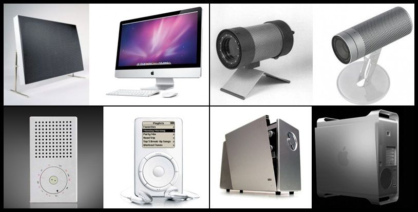
Logo Examples
Color Palette
What it is & Why You Need It:
Color is one of the most noticeable and tangible components of your visual brand. Having specific colors for your brand helps with brand recognition and memorability. It plays such a huge role that some brands have certain hues protected by law and copyrighted. Color is serious business! So lets get down to it!
How to Develop it
- Understand Color Psychology: The psychology of color tells us that certain colors trigger certain emotions from people who see them, often subconsciously without noticing. It tells us that when we see blue we feel secure and safe, and when we see red we feel passionate and excited.
- Think back to your brand mission, vision and values. What emotions does your brand promote and project? Chose the colors for your brand based off these emotions. See below a visual explanation of color psychology and a few examples to go along with it.
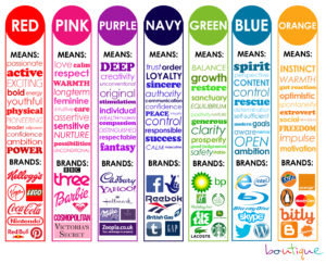
Color Psychology Infographic
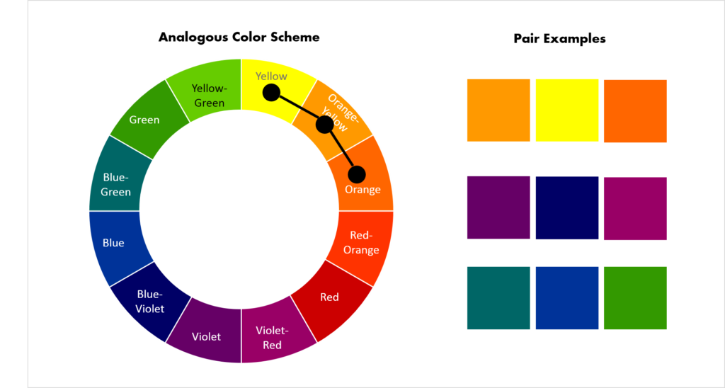
Understand How To Combine Colors:
- For color combinations we are going to be using the color wheel to help us put together the perfect mix of colors for your brand. Here are some techniques to help you find the perfect mixture.

The Color Wheel
- Complementary color scheme: Colors that are opposite each other on the color wheel are considered to be complementary colors (example: red and green).
- Analogous color scheme: Analogous color schemes use colors that are next to each other on the color wheel. They usually match well and create serene and comfortable designs.
- Triadic color scheme: A triadic color scheme uses colors that are evenly spaced around the color wheel.
- Split-Complementary color scheme: The split-complementary color scheme is a variation of the complementary color scheme. In addition to the base color, it uses the two colors adjacent to its complement.
- Rectangle (tetradic) color scheme: The rectangle or tetradic color scheme uses four colors arranged into two complementary pairs.
- Square color scheme: The square color scheme is similar to the rectangle, but with all four colors spaced evenly around the color circle.
Chose Main Colors & Accent Color:
After knowing what emotions you want to convey for your brand, select 2-3 main colors that will be used consistently in everything you do as a business to create brand consistency. Choose one accent color that will “pop” out from the rest of the elements on your designs. This color should stand out because it’s brighter, darker, or in some way different from your main 2-3 colors.
Typography | Font Use
What it is & Why You Need It:
Defined as “the art or process of setting and arranging types” carefully-chosen fonts are a powerful way to communicate your brand voice. When developing your visual brand identity, consider how typography will fit into the overall brand architecture. Design tells us how you look. Type tells us how you sound. The tone of voice used by your type is your brand’s fonts.
How to Develop it
- Understand Your Font Categories
- Serif: Serif fonts have a line at the end of each stroke of their letters. Considered to be traditional and professional in style. Used for headlines, body copy, and formal applications.
- Sans Serif: “Sans-serif” literally means “without serif” — these fonts don’t have the extra lines on the ends of letters. Considered to be crisp and modern in style. Subheads, bold copy, and digital copy are the usual uses for this font.
- Script: Script typefaces are based upon the varied and often fluid stroke done by handwriting, they also have connecting letters. Considered to be fun and casual in style. It is a good choice for formal and special events, announcements, and invitations.
- Display / Decorative: Meant To capture attention with unique characteristics like swashes and varying sizes etc. Considered to be decorative and fun in style.

Typography / Font Categories
Recommended Font Combinations:
The key to pairing fonts is creating contrast. Whether it’s through mixing up font categories, font weights or font sizes.
- Super Grotesk & Minion Pro.
- Montserrat & Courier New.
- Rockwell Standard & Lora.
- Copernicus & Proxima Nova.
- Century Gothic & PT Serif.
- Kaufmann & NeutraDemi.
- Playfair Display & Museo Sans
- Choose Fonts For Usage in the following
- Logo Font: Choose and/or edit a font that you will use specifically for your logo
- Secondary Font: Chose a font that you will use for Titles, Headings, Buttons, Signs etc
- Body Text Font: Chose a font that you will use for documents and body text on website, print graphics etc

Honeywell Brand Guidelines, Typography
Iconography
What it is & Why You Need It:
Custom brand Icons are a great way to highlight key messages and content on your website/app etc.
How To Develop It:
Ensure your icon set has a clear design language across all icons. Whether it be modern, sleek, rustic etc consistency is key. Borrow from other brand assets for inspiration to develop your icon set such as logos, fonts and mascots. We generally have two categories of icons.
- Product Icons: These are the visual expression of a brand’s products, services, and tools.
- System Icons: These represent a command, file, device, directory, or common actions.

Brand Iconography Example
Patterns | Textures
What it is & Why You Need It:
This is an aspect of branding that many companies overlook. Pattern and textures add character, distinction and an extra element of style and consistency to your brand! Consider them the same as wallpaper. Used to accentuate, but not steal the show from your logo.
How To Develop It:
Mix and match while pulling together different styles to add character and distinction to your brand identity. Stripes, geometric shapes and illustrative patterns all mix well when you ground them with a common color palette. Mix small, soft elements with larger, more robust patterns to add texture and flow.

Patterns and Textures
Conclusion
Finally brands can use their visual Identity to further create a brand style guide. Designers can use this when designing for your brand to keep brand consistency.
So here we have it, 5 building blocks of a great visual identity.
- Logo
- Color Palette
- Typography
- Iconography
- Patterns/Textures
Let us know if you think we missed anything in the comments or if you have any questions!
Need further help developing a visual identity for your brand? Fill out our form and speak with a branding expert from Ikonik Digital today!
The post 5 Visual Branding Essentials Your Audience Instantly Judges You On appeared first on Ikonik Digital Agency | Digital Marketing & Web Development Agency | Jamaica.
]]>