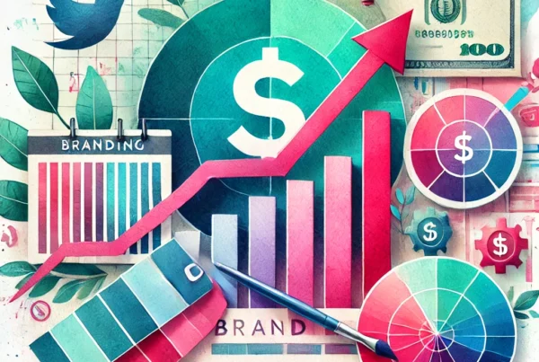
One of the major keys to a successful brand is a clean consistent visual identity, you can confirm this with DJ Khaled if you want. To put it simply, in order to gain brand recognition you have to look like you, regardless of where you’re being represented. This is achieved by using your brand’s logo, colors and icons consistently across different platforms and mediums when communicating your value.
In this article we are going to take you through 5 building blocks that are crucial to you developing a consistent visual identity.
- Logo
- Color Palette
- Typography
- Iconography
- Patterns/Textures
Logo
What It Is & Why You Need It:
A logo is a graphic element, symbol or icon designed to serve as the cornerstone of your company’s visual identity. Establishing a clear identity for your brand starts with a logo.
How To Develop it:
- Understand The 3 Types Of Logos:
- Font Based Logos: Stylised fonts spelling out your brand or company name, similar to FLOW Jamaica, Singer or JPS.
- Illustrative Logos: Characterised by a symbol or image that actually describes what you do like a sandwich on a sandwich shop logo, we can find an example of this with the logo for Highway2000 which features a sketch of a highway on it.
- Abstract Logos: One-off symbols that get meanings built around them via great marketing and customer involvement such as the Nike swoosh or McDonalds Golden Arches.
- Research & Ideate:
- Research how the best company’s in your industry design their logos and narrow down a few that you like best.
- What kind of personality or message you want to be conveyed with your logo? fun and childish or serious and professional?
- Sketch, Design & Edit:
- Make a few handmade sketches to visually represent how you want your logo to look.
- It is of course recommended to leave the designing to a professional graphic designer to bring your logo sketch to a crisp digital format.
- Ensure your logo can be can be reproduced in black and white so that it can be faxed, photocopied or used in a black-and-white ad as effectively as in color.

Logo Examples
Color Palette
What it is & Why You Need It:
Color is one of the most noticeable and tangible components of your visual brand. Having specific colors for your brand helps with brand recognition and memorability. It plays such a huge role that some brands have certain hues protected by law and copyrighted. Color is serious business! So lets get down to it!
How to Develop it
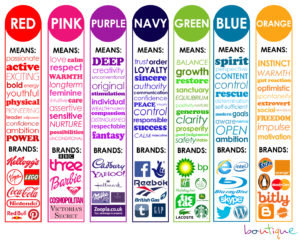
- Understand Color Psychology: The psychology of color tells us that certain colors trigger certain emotions from people who see them, often subconsciously without noticing. It tells us that when we see blue we feel secure and safe, and when we see red we feel passionate and excited.
- Think back to your brand mission, vision and values. What emotions does your brand promote and project? Chose the colors for your brand based off these emotions. See below a visual explanation of color psychology and a few examples to go along with it.

Color Psychology Infographic
Understand How To Combine Colors:
- For color combinations we are going to be using the color wheel to help us put together the perfect mix of colors for your brand. Here are some techniques to help you find the perfect mixture.

The Color Wheel
- Complementary color scheme: Colors that are opposite each other on the color wheel are considered to be complementary colors (example: red and green).
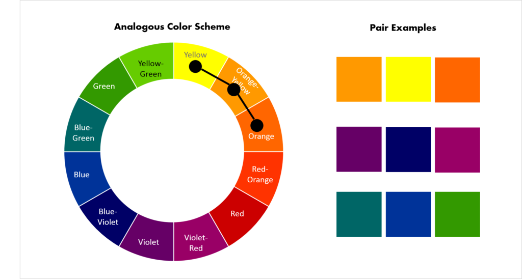
- Analogous color scheme: Analogous color schemes use colors that are next to each other on the color wheel. They usually match well and create serene and comfortable designs.
- Triadic color scheme: A triadic color scheme uses colors that are evenly spaced around the color wheel.
- Split-Complementary color scheme: The split-complementary color scheme is a variation of the complementary color scheme. In addition to the base color, it uses the two colors adjacent to its complement.
- Rectangle (tetradic) color scheme: The rectangle or tetradic color scheme uses four colors arranged into two complementary pairs.
- Square color scheme: The square color scheme is similar to the rectangle, but with all four colors spaced evenly around the color circle.
Chose Main Colors & Accent Color:
After knowing what emotions you want to convey for your brand, select 2-3 main colors that will be used consistently in everything you do as a business to create brand consistency. Choose one accent color that will “pop” out from the rest of the elements on your designs. This color should stand out because it’s brighter, darker, or in some way different from your main 2-3 colors.
Typography | Font Use
What it is & Why You Need It:
Defined as “the art or process of setting and arranging types” carefully-chosen fonts are a powerful way to communicate your brand voice. When developing your visual brand identity, consider how typography will fit into the overall brand architecture. Design tells us how you look. Type tells us how you sound. The tone of voice used by your type is your brand’s fonts.
How to Develop it
- Understand Your Font Categories
- Serif: Serif fonts have a line at the end of each stroke of their letters. Considered to be traditional and professional in style. Used for headlines, body copy, and formal applications.
- Sans Serif: “Sans-serif” literally means “without serif” — these fonts don’t have the extra lines on the ends of letters. Considered to be crisp and modern in style. Subheads, bold copy, and digital copy are the usual uses for this font.
- Script: Script typefaces are based upon the varied and often fluid stroke done by handwriting, they also have connecting letters. Considered to be fun and casual in style. It is a good choice for formal and special events, announcements, and invitations.
- Display / Decorative: Meant To capture attention with unique characteristics like swashes and varying sizes etc. Considered to be decorative and fun in style.

Typography / Font Categories
Recommended Font Combinations:
The key to pairing fonts is creating contrast. Whether it’s through mixing up font categories, font weights or font sizes.
- Super Grotesk & Minion Pro.
- Montserrat & Courier New.
- Rockwell Standard & Lora.
- Copernicus & Proxima Nova.
- Century Gothic & PT Serif.
- Kaufmann & NeutraDemi.
- Playfair Display & Museo Sans
- Choose Fonts For Usage in the following
- Logo Font: Choose and/or edit a font that you will use specifically for your logo
- Secondary Font: Chose a font that you will use for Titles, Headings, Buttons, Signs etc
- Body Text Font: Chose a font that you will use for documents and body text on website, print graphics etc

Honeywell Brand Guidelines, Typography
Iconography
What it is & Why You Need It:
Custom brand Icons are a great way to highlight key messages and content on your website/app etc.
How To Develop It:
Ensure your icon set has a clear design language across all icons. Whether it be modern, sleek, rustic etc consistency is key. Borrow from other brand assets for inspiration to develop your icon set such as logos, fonts and mascots. We generally have two categories of icons.
- Product Icons: These are the visual expression of a brand’s products, services, and tools.
- System Icons: These represent a command, file, device, directory, or common actions.

Brand Iconography Example
Patterns | Textures
What it is & Why You Need It:
This is an aspect of branding that many companies overlook. Pattern and textures add character, distinction and an extra element of style and consistency to your brand! Consider them the same as wallpaper. Used to accentuate, but not steal the show from your logo.
How To Develop It:
Mix and match while pulling together different styles to add character and distinction to your brand identity. Stripes, geometric shapes and illustrative patterns all mix well when you ground them with a common color palette. Mix small, soft elements with larger, more robust patterns to add texture and flow.

Patterns and Textures
Conclusion
Finally brands can use their visual Identity to further create a brand style guide. Designers can use this when designing for your brand to keep brand consistency.
So here we have it, 5 building blocks of a great visual identity.
- Logo
- Color Palette
- Typography
- Iconography
- Patterns/Textures
Let us know if you think we missed anything in the comments or if you have any questions!
Need further help developing a visual identity for your brand? Fill out our form and speak with a branding expert from Ikonik Digital today!

Glenford Scott is the Founder & Director of Ikonik Digital, a performance-driven marketing agency helping brands scale with strategy, storytelling, and smart execution.
With years of experience driving results across industries, from hospitality to education — Glenford specializes in turning clicks into customers and ideas into revenue.