
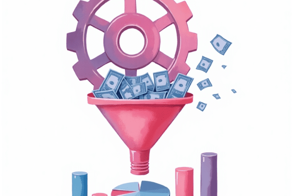
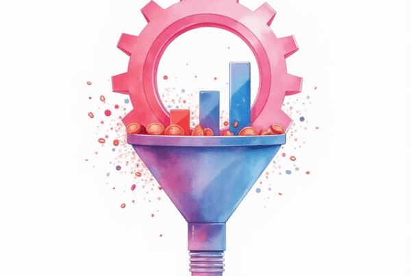
The Role of Visual Hierarchy in Conversion Optimization
Visual hierarchy plays a crucial role in driving conversion optimization. In today’s competitive digital space, business owners and corporate executives need every advantage. A clear visual hierarchy on your website guides visitors toward taking action. It ensures that the most important information catches the eye. In this post, we will explore how visual hierarchy influences conversion rates and share actionable tips to enhance your design.
Understanding Visual Hierarchy
Visual hierarchy is the arrangement of elements on a page. It directs the viewer’s attention through a structured layout. This design principle helps users find key information quickly. When done right, it leads to higher engagement and better conversion rates.
Visual hierarchy works by establishing a clear order of importance. Designers use size, color, contrast, and positioning to influence this order. The goal is to make sure that the most important messages are seen first. Business owners must leverage visual hierarchy to reduce confusion and guide visitors toward their calls to action (CTAs).
Consider your website as a roadmap. Visitors follow the visual cues you provide. When these cues are strong and clear, users are more likely to complete your desired actions, such as signing up or making a purchase.
Why Visual Hierarchy Matters in Conversion Optimization
Conversion optimization focuses on turning visitors into customers. Visual hierarchy is a powerful tool in this process. It creates a user-friendly experience that builds trust and reduces friction.
Key Benefits
- Increased Clarity: A well-structured page helps visitors understand your message quickly.
- Improved Engagement: Clear visual cues capture attention and keep users on the page longer.
- Higher Conversion Rates: When users find what they need easily, they are more likely to convert.
- Enhanced User Experience: A logical layout makes the website more enjoyable to use.
By enhancing visual hierarchy, you directly address common business pain points such as high bounce rates and low engagement. This leads to better overall performance and improved revenue.
Core Principles of Visual Hierarchy
To harness the power of visual hierarchy, you must understand its core principles. These principles guide your design decisions and improve conversion optimization.
1. Size and Scale
Larger elements naturally draw more attention. Headlines, CTAs, and key images should be more prominent. Use larger fonts for headlines and bigger buttons for actions. This practice ensures that visitors do not miss critical information.
2. Color and Contrast
Color plays a vital role in visual hierarchy. High contrast between elements makes them stand out. Use contrasting colors to highlight CTAs and important messages. Ensure that your color choices align with your brand guidelines. A vibrant button on a clean background can drive clicks and conversions.
3. Typography
Typography matters greatly in setting the tone of your website. Use a hierarchy in your fonts. For example, headlines should use a bold, large typeface, while body text remains smaller and simpler. Consistent typography reinforces the structure of your page.
4. White Space
White space, also known as negative space, is the empty area around elements. It prevents a cluttered design and helps guide the eye. Adequate white space ensures that users do not feel overwhelmed. It makes the content more digestible and improves readability.
5. Alignment and Positioning
How you position elements influences their impact. Items placed at the top or in the center of the page often get noticed first. Use alignment to create a natural flow of information. Group related elements together. This practice helps users process the content logically.
Applying Visual Hierarchy for Better Conversions
Now that you understand the principles, let’s explore how to apply visual hierarchy to boost conversions. Below are actionable strategies that you can implement right away.
1. Create a Strong First Impression
Your landing page is the first interaction with your visitors. A clear visual hierarchy makes a strong first impression. Here are some tips to achieve this:
- Use a Bold Headline: Ensure your headline is clear and benefit-driven. It should tell visitors what you offer and why they need it.
- Highlight Key Visuals: Use images or videos that represent your core message. They must be of high quality and directly related to your offer.
- Keep It Simple: Avoid clutter. Use white space to separate sections and allow the design to breathe.
A strong first impression reduces bounce rates and increases the likelihood of conversion.
2. Guide Visitors with Clear CTAs
Your call-to-action buttons are critical conversion elements. They should be unmistakable and compelling. To optimize CTAs through visual hierarchy:
- Make CTAs Prominent: Use larger buttons and contrasting colors. The CTA must be one of the first things visitors notice.
- Use Action-Oriented Text: Use phrases like “Get Started Now” or “Download Your Free Guide.”
- Place CTAs Strategically: Position them where visitors naturally look, such as near the top of the page or after a persuasive section.
When visitors can easily identify the next step, conversion rates improve significantly.
3. Organize Content for Easy Scanning
Most users scan web pages instead of reading every word. A well-organized visual hierarchy caters to this behavior. Break your content into sections with clear headings and subheadings. Use bullet points to summarize key benefits.
Example of a Content Section:
- Headline: “Boost Your Sales with Our Proven Strategies”
- Subheadings: “Increase Traffic,” “Enhance Engagement,” “Drive Conversions
- Bullet Points:
- Gain valuable insights
- Improve website usability
- Achieve measurable results
This structure helps visitors quickly understand your offer and motivates them to explore further.
4. Use Visual Cues to Direct Attention
Visual cues can subtly guide the viewer’s attention to the most important areas of your page. These cues include arrows, icons, or lines that connect related elements. For example, you might use a subtle arrow to lead from a compelling statistic to your CTA button.
Additionally, you can use design elements like color blocks or gradients to frame key content. These visual cues enhance the overall flow and make it easier for users to follow your narrative.
5. Prioritize Mobile Users
Mobile devices account for a significant portion of web traffic. Ensuring that your visual hierarchy works on mobile is crucial. Responsive design must maintain the same level of clarity and usability as on desktop. Use larger fonts and buttons on mobile. Keep the layout simple and vertically oriented.
By addressing mobile users, you ensure that all visitors have a seamless experience that promotes conversions.
Addressing Business Pain Points
Business owners often face challenges when optimizing landing pages. These pain points include:
- High Bounce Rates: Users leave before interacting with your content.
- Low Engagement: Visitors do not read or explore your page.
- Confusing Layouts: Cluttered designs make it hard for users to find information.
- Weak CTAs: Unclear or poorly placed CTAs lead to lost conversions.
By improving visual hierarchy, you can tackle these issues head-on. A clear layout, strong visual cues, and prominent CTAs reduce friction and guide users toward conversion. This approach not only solves immediate challenges but also builds a foundation for sustained growth.
Best Practices for Implementing Visual Hierarchy
Here is a summary of best practices to follow when designing your landing page:
- Define Clear Priorities: Identify the most important elements on your page.
- Use Contrasting Colors: Ensure key elements stand out.
- Leverage White Space: Avoid clutter by using adequate spacing.
- Simplify Navigation: Make it easy for visitors to find what they need.
- Place CTAs Strategically: Position buttons where users are most likely to click.
- Test and Iterate: Regularly use A/B testing to refine your design.
Following these practices will help you create a landing page that maximizes conversions. You can adjust and experiment with different layouts to find what works best for your audience.
Tools and Resources
Several tools can help you design and test effective visual hierarchies. These tools can provide insights and allow you to experiment with different design elements.
Recommended Tools
- Sketch or Adobe XD: Use these design tools to create mockups and prototypes.
- Hotjar: Visualize user behavior with heatmaps and session recordings.
- Google Optimize: Run A/B tests to compare different design elements.
- Crazy Egg: Analyze where visitors click and scroll.
- Figma: Collaborate with your team on design projects.
Using these tools, you can gather data and feedback. This helps you continuously improve your landing page design and increase conversions.
The Future of Visual Hierarchy and Conversion Optimization
As digital experiences evolve, the importance of visual hierarchy will only grow. Trends such as minimalistic design and micro-interactions will play a bigger role in guiding user behavior. Business owners must stay updated with the latest design practices to remain competitive.
Moreover, advances in AI and machine learning will likely provide deeper insights into user preferences. This data will enable more personalized and adaptive visual hierarchies. By embracing these innovations, you can further enhance your conversion rates and drive sustained growth.
How to Start Implementing Visual Hierarchy Today
Now that you understand the role of visual hierarchy in conversion optimization, it’s time to put these insights into action. Begin by auditing your current landing pages. Ask yourself if the layout clearly guides visitors toward your key messages and CTAs.
Steps to Get Started
- Conduct a Visual Audit: Review your landing page design and note areas for improvement.
- Gather Data: Use tools like heatmaps and analytics to see where users focus their attention.
- Prioritize Changes: Identify the most critical elements that need enhancement.
- Test New Designs: Implement changes and run A/B tests to measure their impact.
- Iterate Based on Feedback: Refine your design continuously based on user behavior and feedback.
This step-by-step approach will help you create a landing page that not only looks good but also drives higher conversions.
Conclusion: Visual Hierarchy as a Conversion Powerhouse
Visual hierarchy is a fundamental element in conversion optimization. A well-structured landing page uses size, color, typography, and white space to guide visitors toward taking action. When executed correctly, visual hierarchy improves clarity, enhances user engagement, and ultimately drives higher conversion rates.
Business owners and corporate executives must focus on this aspect of design. Addressing common pain points like high bounce rates and low engagement can lead to significant improvements in performance. By investing in visual hierarchy, you build a robust foundation for your digital marketing efforts.
Remember, every element on your page should have a purpose. A clear visual hierarchy not only simplifies navigation but also boosts trust and credibility. This strategy is essential for businesses that want to convert visitors into loyal customers.
Call to Action
Are you ready to transform your landing pages with a powerful visual hierarchy? At Ikonik Digital, we specialize in designing and optimizing pages that drive results. We understand the challenges you face, and we can help you create a visually engaging experience that boosts conversions.
Contact us today at [email protected] for personalized advice, strategy discussions, or further assistance. Let us help you turn your website visitors into loyal customers and drive your business forward!

Glenford Scott is the Founder & Director of Ikonik Digital, a performance-driven marketing agency helping brands scale with strategy, storytelling, and smart execution.
With years of experience driving results across industries, from hospitality to education — Glenford specializes in turning clicks into customers and ideas into revenue.


[…] Ikonik Digital. (2025). The Role of Visual Hierarchy in Conversion Optimization. Retrieved from https://ikonik.digital/blog/the-role-of-visual-hierarchy-in-conversion-optimization/ […]