
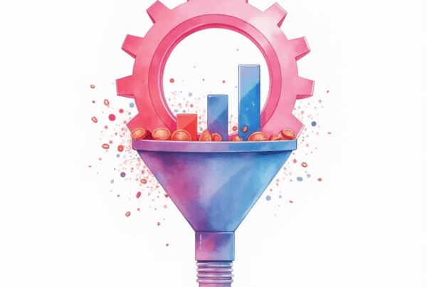
The Impact of Color and Contrast on Conversion Rates
Color and contrast matter greatly. They influence user behavior. Business owners and executives must understand these elements. They are crucial for boosting conversion rates.
Introduction
Color and contrast play a key role in design. They shape first impressions. They guide users through your site. In today’s digital world, these elements are essential for success.
Many businesses struggle with low conversion rates. They invest in traffic without optimizing design. Yet, a smart use of color and contrast can change that. You can increase engagement and sales with simple tweaks.
This guide will explain how color and contrast affect conversions. We will share actionable tips. You will learn how to create an appealing design. Ultimately, you can drive more revenue with these insights.
What Are Color and Contrast in Web Design?
Color and contrast are vital parts of web design. They set the tone of your website. They influence mood and perception. In short, they help convert visitors into customers.
Understanding Color
Color evokes emotions and builds brand identity. Different colors can trigger different feelings. For example, blue often conveys trust. Red can spark urgency and excitement.
Consider these key points about color:
- Emotion: Colors affect how users feel.
- Branding: Colors reinforce your brand image.
- Attention: Bright colors attract the eye.
You should choose colors that match your brand. Use them consistently across your website. This builds recognition and trust.
Understanding Contrast
Contrast is the difference between elements. It helps create a visual hierarchy. It makes your content stand out. High contrast improves readability and focus.
For example, dark text on a light background is easy to read. Similarly, contrasting colors on call-to-action (CTA) buttons draw attention. Contrast guides the user through your design.
Keep these tips in mind:
- Readability: Ensure text is clear against the background.
- Emphasis: Use contrast to highlight key elements.
- Balance: Avoid overwhelming users with too much contrast.
By understanding both color and contrast, you lay a strong foundation for better conversion rates.
The Psychology Behind Colors
Color psychology is fascinating and powerful. It helps you connect with your audience. Each color evokes a unique response. Business owners can use these insights to drive conversions.
How Colors Affect Emotions
Colors have different meanings. Blue creates a sense of calm and trust. Red can evoke urgency. Green often represents health and growth. Yellow radiates optimism and energy.
These emotions can influence buying decisions. When users feel positive, they are more likely to convert. Therefore, choose colors that match your goals.
Consider these examples:
- Blue: Ideal for financial and tech industries.
- Red: Perfect for clearance sales and fast actions.
- Green: Works well for eco-friendly brands.
- Yellow: Great for attracting attention in promotions.
By aligning your color palette with your message, you build a stronger connection with your visitors.
Cultural Variations in Color Perception
Remember, color meanings can vary by culture. A color that signals luck in one country may have a different meaning elsewhere. Global brands must consider these differences. Test your design with diverse audiences to ensure broad appeal.
Moreover, keep your target market in mind. Use colors that resonate with your audience’s values. This personalization leads to higher engagement and conversions.
The Role of Contrast in Conversion Rates
Contrast is not just about readability. It also influences user actions. The right contrast can boost your conversion rates significantly.
Enhancing CTAs with Contrast
Call-to-action buttons are key to conversions. They must stand out on your page. A high-contrast CTA draws the user’s eye immediately. Use contrasting colors to make your CTAs pop.
For example:
- A bright button on a neutral background.
- Dark text on a light-colored button.
- Bold outlines to define interactive elements.
These design choices guide users to take action. They help you achieve your conversion goals.
Improving Readability and Navigation
Good contrast improves overall readability. It makes text easier to scan. This is important for busy executives and business owners. They need to grasp information quickly.
When contrast is low, users may struggle. They can miss important details or become frustrated. By ensuring high contrast, you create a smoother user experience. This leads to longer visits and higher conversions.
Visual Hierarchy and Focus
Contrast also establishes visual hierarchy. It helps users decide where to look first. Use contrast to highlight your key messages. This directs attention to the most important parts of your page.
A clear hierarchy leads to better navigation. Users will find what they need faster. In turn, they are more likely to convert.
How to Optimize Color and Contrast for Better Conversion Rates
Optimizing color and contrast is a process. It involves testing and fine-tuning. Follow these steps to achieve the best results.
Step 1: Set Clear Objectives
Before changing your design, define your goals. Ask yourself:
- What action do I want users to take?
- Which elements need emphasis?
- How can I guide users through my page?
Clear objectives shape your design choices. They help you focus on what matters most.
Step 2: Choose a Complementary Color Palette
Select colors that work well together. Use tools like Adobe Color or Coolors.co. These tools generate harmonious palettes. Make sure your colors align with your brand.
A good palette should include:
- Primary Colors: For the main design elements.
- Secondary Colors: To support and complement.
- Accent Colors: To highlight CTAs and key messages.
A balanced palette creates a visually appealing site. It also builds trust with your audience.
Step 3: Ensure Sufficient Contrast
Test the contrast of your design. Use online tools like WebAIM Contrast Checker. This tool helps you verify readability. Ensure that your text contrasts well with the background.
Key guidelines include:
- A contrast ratio of at least 4.5:1 for body text.
- A higher ratio for important elements.
- Adjust colors as needed for accessibility.
By following these guidelines, you enhance readability and usability.
Step 4: Test Different Variations
A/B testing is essential. Create different versions of your design. Test varying color combinations and contrast levels. Measure which version performs best.
Use these methods:
- Heatmaps: To see where users click.
- User Surveys: To gather feedback on design.
- Analytics: To track conversion rates.
Testing ensures that you make data-driven decisions. It helps you refine your approach continuously.
Best Practices and Tips for Using Color and Contrast
Adopting best practices will help you maximize your results. Here are some actionable tips:
- Use a Limited Color Palette: Avoid overwhelming users with too many colors. Stick to 3-4 main colors.
- Maintain Consistency: Use the same colors for similar elements. This builds a cohesive brand identity.
- Highlight CTAs: Choose colors that stand out from the background. Use contrast to make CTAs pop.
- Test Readability: Always check that text is legible. Use contrast checkers for accessibility.
- Monitor Trends: Stay updated on color trends in your industry. Adapt your palette as needed.
These practices help create a design that converts. They ensure that every element has a clear purpose.
Tools and Techniques for Measuring Color and Contrast
Many tools can help you optimize your design. They provide insights and guide your decisions.
Recommended Tools
Here is a list of useful tools:
- WebAIM Contrast Checker: Verify text and background contrast.
- Adobe Color: Generate harmonious color palettes.
- Coolors.co: Quickly create and test color schemes.
- Google Analytics: Track user behavior and conversion rates.
- Hotjar: Use heatmaps to see where users interact.
Comparison Table of Tools
| Tool | Purpose | Key Feature |
|---|---|---|
| WebAIM Contrast Checker | Check color contrast | Provides accessibility scores |
| Adobe Color | Create color palettes | Offers color harmony rules |
| Coolors.co | Generate and test color schemes | Fast and user-friendly |
| Google Analytics | Analyze user behavior | Detailed conversion tracking |
| Hotjar | Visualize user interactions | Heatmaps and session recordings |
This table offers a quick overview. Use these tools to enhance your design. They make it easier to optimize for conversions.
Common Pitfalls and How to Avoid Them
Even small mistakes can hurt your conversions. Recognize common pitfalls and learn to avoid them.
Pitfall 1: Overcomplicating Your Palette
Using too many colors can confuse users. A cluttered palette distracts from your message. Stick to a simple, cohesive scheme. This maintains focus and clarity.
Pitfall 2: Ignoring Mobile Users
Mobile devices require special attention. Low contrast can harm readability on small screens. Always test your design on various devices. This ensures a seamless user experience.
Pitfall 3: Neglecting Accessibility
Poor contrast can exclude some users. Ensure that your design meets accessibility standards. Use contrast checkers regularly. Accessible design benefits all users.
Pitfall 4: Inconsistent Use of Colors
Inconsistent color use weakens your brand identity. Keep your colors consistent across all pages. This builds trust and reliability.
Avoid these pitfalls by following best practices. Small improvements can lead to major gains in conversion rates.
Strategies for Business Owners and Executives
Business leaders must focus on results. Here are strategies tailored for busy professionals.
Focus on Data-Driven Design
Use analytics to guide your decisions. Test different color schemes and contrast levels. Analyze user feedback and behavior. This data will help you refine your strategy.
Invest in Professional Design
Consider hiring experts if needed. A professional can optimize your design faster. They bring experience and technical skills. This investment often leads to better results.
Prioritize User Experience
Make your website user-friendly. Ensure that every element serves a purpose. A clear, engaging design leads to higher conversions. Happy users become loyal customers.
Stay Updated with Trends
The digital landscape changes fast. Follow industry blogs and design news. Attend webinars and workshops. Continuous learning keeps you ahead of the curve.
These strategies empower you to take charge. They help you make informed decisions. Ultimately, you will boost your conversion rates.
Tips for A/B Testing Color and Contrast
A/B testing is a powerful way to refine your design. Here are some tips to run effective tests:
- Test One Element at a Time:
Change only the color or contrast of one element. This isolates its impact on conversions. - Use a Large Sample Size:
Ensure you have enough visitors. This improves the reliability of your results. - Monitor Key Metrics:
Track conversion rates, bounce rates, and user engagement. These metrics help determine success. - Iterate and Optimize:
Use test results to refine your design. Continuously improve based on data feedback. - Document Your Changes:
Keep a log of all tests and results. This helps you learn what works best.
These testing strategies lead to smarter design decisions. They ensure that every change you make drives higher conversions.
The Future of Color and Contrast in Digital Marketing
Digital marketing is always evolving. Trends in color and contrast will change too. Here are some future directions to watch.
Emerging Trends
- Dynamic Color Schemes:
Websites may adjust colors based on user behavior. This personalization could drive better engagement. - Dark Mode Options:
Many users now prefer dark mode. Offering both light and dark themes can improve usability. - Augmented Reality (AR) Integration:
AR may allow users to see products in their own space. Color accuracy will become even more critical.
The Role of AI
Artificial intelligence will influence design. AI can analyze user preferences in real time. It may suggest color adjustments on the fly. This technology will make your design more adaptive and effective.
Continuous Innovation
Stay curious and open to change. The best companies continuously innovate. They experiment with new design techniques. This proactive approach can secure long-term success.
Conclusion
Color and contrast are not mere design choices. They are strategic tools that drive conversion rates. By understanding color psychology, you can evoke the right emotions. By optimizing contrast, you create clear calls to action and improve readability.
Every business benefits from a well-designed website. Business owners and executives know that first impressions matter. A strong color palette and proper contrast can build trust, guide user behavior, and ultimately boost sales.
We have covered the basics of color and contrast. We have shared actionable tips and real-world examples. You now have a blueprint for improving your site’s performance.
Remember, small changes can lead to big results. Test different palettes and contrast levels. Use data to inform your decisions. The result will be a website that not only attracts visitors but also converts them into loyal customers.
Call to Action
Are you ready to transform your website with the right colors and contrast? Do you need expert guidance to boost your conversion rates?
Contact Ikonik Digital today!
Reach out to us at [email protected] for further assistance, strategy discussions, or inquiries. Our team is here to help you optimize your design and drive growth.
Thank you for reading our comprehensive guide. We hope you found these insights valuable and actionable. Take the next step toward higher conversions today!
For personalized advice and innovative strategies, contact Ikonik Digital at [email protected]. Let us help you create a visually stunning and conversion-optimized website that propels your business forward.

Glenford Scott is the Founder & Director of Ikonik Digital, a performance-driven marketing agency helping brands scale with strategy, storytelling, and smart execution.
With years of experience driving results across industries, from hospitality to education — Glenford specializes in turning clicks into customers and ideas into revenue.


[…] the details – minor details as small as an arrow on a button – matter quite a bit for conversions. Test small graphical elements, and see if arrows or the like can work for […]