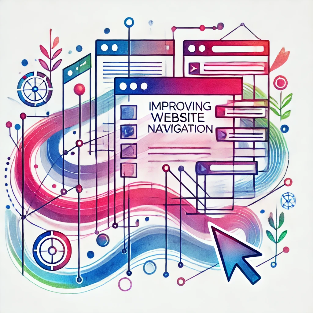
How to Improve Website Navigation for a Seamless User Experience
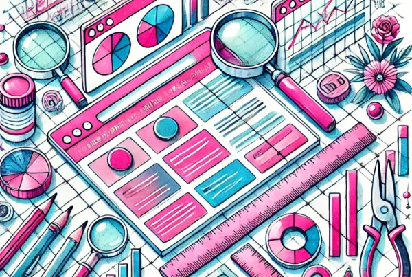
Website navigation is one of the most critical aspects of user experience (UX). How users interact with your website determines whether they stay, explore, or leave. If your navigation is confusing, cluttered, or difficult to use, you risk losing potential customers and reducing conversions. On the other hand, a seamless, intuitive navigation system enhances user experience, boosts engagement, and encourages visitors to explore your site further.
In this blog post, we’ll explore five key factors to help you improve website navigation. By implementing these tips, you can create a positive experience that keeps visitors coming back.
1. Simplify Your Menu Structure
A clean, simple, and well-organized navigation menu is essential for a good user experience. Overcrowded or complicated menus overwhelm visitors, making it difficult for them to find what they need quickly. Simplifying your navigation allows users to move through your site with ease, reducing frustration and improving overall satisfaction.
Best Practices:
- Limit the number of menu items: Keep your main navigation bar to a maximum of 7 menu items. Anything more can make the menu feel cluttered.
- Use clear and concise labels: Avoid jargon and use simple, easy-to-understand words for your menu items. For example, instead of “Solutions,” use “Services.”
- Prioritize important pages: Place your most important pages, such as Home, About, Services, and Contact, at the top or in the most prominent positions in your menu.
Example:
For an e-commerce website, your menu could include sections like:
- Home
- Shop
- Categories (e.g., Men, Women, Accessories)
- About Us
- Blog
- Contact Us
This streamlined approach makes it easy for users to find products, company information, and customer service.
2. Make Navigation Responsive
In today’s mobile-first world, your website’s navigation must work just as well on mobile devices as on desktops. Responsive design ensures your navigation adjusts seamlessly to various screen sizes, providing an optimal experience across all devices.
Best Practices:
- Use a hamburger menu for mobile: The hamburger icon (three stacked lines) is a widely recognized symbol for mobile menus. It saves space while giving users easy access to your site’s main sections.
- Keep key actions easily accessible: Ensure critical actions (like the shopping cart, search bar, and contact button) are visible and easy to tap on smaller screens.
Example:
When users visit your website on mobile, the menu could collapse into a hamburger icon. When clicked, it expands into a full navigation menu that’s easy to scroll through and tap on.
3. Use Descriptive Links and Labels
Navigation links should clearly indicate where they lead. Vague labels can confuse visitors, making them hesitant to click. Descriptive, intuitive labels guide users to the right content quickly, improving the overall experience and reducing bounce rates.
Best Practices:
- Be specific with your language: Use labels like “Our Services” or “Explore Our Portfolio” instead of general terms like “Click Here.”
- Use action words: Verbs like “Shop,” “Discover,” and “Learn” prompt users to take action.
- Avoid internal jargon: Use terminology your audience understands. If technical terms are necessary, provide a glossary or simpler alternative.
Example:
For a financial services website, instead of using a vague label like “Resources,” use “Retirement Planning” or “Tax Tips.”
4. Optimize Search Functionality
An effective search bar is one of the most powerful tools for improving website navigation. Users often prefer search when they’re looking for something specific and don’t want to waste time navigating through multiple pages. A good search feature lets users quickly locate what they need without frustration.
Best Practices:
- Make the search bar visible: Place it in an accessible location, such as the top of the page or in the header.
- Use autosuggest or autocomplete: Show suggestions as users type to help them find relevant content faster.
- Offer filters: On e-commerce websites, filters can narrow search results by categories, price range, or other criteria.
Example:
An e-commerce site’s search bar could suggest popular products and categories. For instance, typing “women’s shoes” might bring up categories like “high heels” or “sandals.”
5. Improve Website Load Speed
Website load speed significantly impacts navigation and user experience. Slow websites lead to higher bounce rates, as users are unlikely to stay if a page takes too long to load. A fast-loading site encourages visitors to explore more and interact with your content.
Best Practices:
- Optimize images and media files: Compress and resize images to reduce load times without sacrificing quality. Use modern file formats like WebP.
- Minimize HTTP requests: Reduce the number of elements (scripts, stylesheets, images) that need to load on each page.
- Leverage browser caching: Store assets locally so repeat visitors don’t need to reload everything from scratch.
Example:
Use tools like Google PageSpeed Insights or GTmetrix to analyze your site’s speed and get suggestions for improvement. If your site takes more than 3 seconds to load, it’s time to optimize.
Conclusion: A Better Navigation Experience Leads to Better Results
Improving website navigation isn’t just about aesthetics. It’s about creating a seamless, enjoyable experience that helps users find what they need quickly and easily. By simplifying your menu, making it mobile-friendly, using clear and descriptive labels, optimizing search functionality, and improving load times, you can enhance usability and keep visitors engaged.
When you prioritize user experience, you’re not only improving your website’s usability but also boosting conversion rates, engagement metrics, and overall customer satisfaction.
Ready to Take Your Website Navigation to the Next Level?
At Ikonik Digital, we specialize in web design and development focused on usability, user experience, and responsive navigation. Whether you need a complete website redesign or improvements to your current navigation structure, we’re here to help!
Contact us at [email protected] to discuss how we can enhance your website’s navigation and create a seamless user experience that drives results.

Mario Frith is the Technical Director and Co-Founder of Ikonik Digital. With over a decade of experience in web development, API integrations, and scalable backend systems, Mario leads the technical strategy behind the digital solutions that power our clients’ success. Whether he’s engineering custom platforms or optimizing infrastructure for performance and security, Mario brings precision, innovation, and clean code to every project.
When he’s not building the web behind the scenes, he’s exploring the latest in cloud architecture, automation, and emerging dev stacks.