The post How to Know If Your Website Redesign Was Worth It — Backed by Data appeared first on Ikonik Digital Agency | Digital Marketing & Web Development Agency | Jamaica.
]]>How to Measure the Success of Your Website Redesign
A website redesign offers an exciting opportunity to refresh your online presence, enhance the user experience, and ultimately drive better results. However, once the redesign is complete, how can you determine if it was truly successful? Measuring the success of a website redesign involves more than just admiring the new design—it requires tracking key metrics and analyzing user feedback to ensure that your updated website meets its objectives. This guide will help you evaluate the effectiveness of your website redesign.
1. Define Your Goals Before the Redesign
Why Setting Goals is Crucial
Before you can measure success, it’s essential to understand what you’re trying to achieve with your redesign. Having clearly defined goals will help you identify which metrics to track and evaluate. Common objectives for website redesigns include:
- Improving User Experience: Enhancing how users interact with the site.
- Increasing Conversions: Encouraging more visitors to take desired actions (e.g., signing up for newsletters, making a purchase).
- Reducing Bounce Rates: Encouraging users to engage with more pages rather than leaving quickly.
- Boosting Search Engine Rankings: Ensuring the website ranks higher for targeted keywords.
With these goals in mind, you can tailor your post-redesign measurements for maximum insight.

2. Key Metrics to Track After the Redesign
Bounce Rate: A Key Indicator of Engagement
Bounce rate refers to the percentage of visitors who leave your website after viewing only one page. A high bounce rate often signals problems with navigation, content relevancy, or slow loading speeds.
- Success Indicator: A well-designed website with improved navigation and engaging content should result in a lower bounce rate.
- Tools to Use: Google Analytics, Hotjar
Time on Page and Pages Per Session: Gauging User Engagement
These metrics tell you how long visitors stay on your website and how many pages they visit in a single session.
- Success Indicator: A user-friendly design and compelling content will increase both time on page and pages per session.
- Tools to Use: Google Analytics, Crazy Egg
Conversion Rate: The Bottom Line of Success
Conversions are the actions you want your users to take, such as completing a purchase or filling out a form. Whether it’s a lead generation form or a product sale, conversion rates are crucial in determining if the redesign has achieved its goals.
- Success Indicator: If your redesign focused on improving CTAs (calls-to-action) or simplifying the checkout process, you should see a higher conversion rate.
- Tools to Use: HubSpot, Google Analytics
Website Speed: Speed Matters
A slow-loading website can frustrate users and lead to high bounce rates. Plus, speed is a factor in search engine rankings.
- Success Indicator: The redesigned website loads faster, ideally within 2-3 seconds.
- Tools to Use: Google PageSpeed Insights, GTmetrix
Mobile Responsiveness: Optimizing for Mobile Traffic
In today’s digital world, mobile-first design is non-negotiable. Your website should work seamlessly across all devices to ensure a smooth user experience.
- Success Indicator: The redesigned site should have improved mobile metrics, including lower bounce rates and higher user engagement.
- Tools to Use: Google Mobile-Friendly Test, BrowserStack
Search Engine Rankings: Keep an Eye on SEO
Your redesign can impact SEO—both positively and negatively. It’s important to monitor keyword rankings to ensure your site maintains or improves its position in search engine results.
- Success Indicator: Improved rankings for targeted keywords and increased organic traffic.
- Tools to Use: SEMrush, Ahrefs, Google Search Console
User Feedback and Surveys: The Qualitative Side of Success
While data is critical, user feedback can provide valuable insights into how well your redesign meets your audience’s needs. Ask your users directly about their experience to gain deeper understanding.
- Success Indicator: Positive feedback about design appeal, ease of navigation, and functionality.
- How to Gather Feedback: Use tools like SurveyMonkey or integrate feedback forms into your website.
3. Compare Before-and-After Metrics
Why You Should Compare Your Pre- and Post-Redesign Data
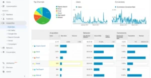
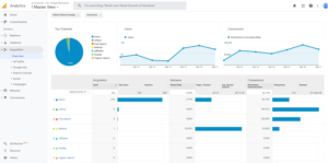
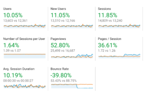
To evaluate the true success of your redesign, compare your key metrics from before and after the redesign. Analyzing trends over similar timeframes helps you identify if changes in traffic, engagement, or conversions are directly related to the redesign.
Example:
- Before Redesign: Bounce rate = 50%, Conversion rate = 2%
- After Redesign: Bounce rate = 35%, Conversion rate = 4%
These improvements show that the redesign positively impacted user behavior and engagement.
4. Monitor Heatmaps and User Behavior
Tracking User Interactions for Deeper Insights
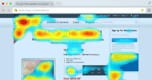
Heatmaps and session recordings provide a visual representation of how users engage with your website. These tools help you understand where users are clicking, how far they scroll, and where they may be getting stuck in the user flow.
- Success Indicator: Increased engagement with important elements like CTAs and improved navigation paths.
- Tools to Use: Hotjar, Crazy Egg
5. Track KPIs Over Time
Success Doesn’t Happen Overnight
The impact of a website redesign isn’t always immediate. It’s essential to track your key performance indicators (KPIs) over the course of several months to spot long-term trends.
Examples of KPIs to Monitor:
- Lead generation rates
- Email sign-ups
- Customer retention rates
This data will give you a clearer picture of how your website continues to perform post-redesign.
6. Assess ROI: Is the Redesign Worth It?
Calculating the Return on Investment
A successful website redesign should generate a return on investment (ROI) that justifies the costs involved. To calculate ROI, compare the costs of the redesign with the additional value it generates.
ROI Formula:
ROI=(Net Profit from Redesign−Redesign CostsRedesign Costs)×100\text{ROI} = \left(\frac{\text{Net Profit from Redesign} – \text{Redesign Costs}}{\text{Redesign Costs}}\right) \times 100
For example, if your redesign cost $10,000 and resulted in $20,000 in additional revenue, your ROI would be 100%.
7. Common Redesign Pitfalls to Avoid
Watch Out for These Mistakes
Despite the best intentions, redesigns sometimes fall short of expectations. Be aware of these common pitfalls:
- SEO Issues: Losing search rankings due to poorly managed URL changes or neglected metadata.
- User Confusion: Introducing overly complex design changes that confuse users.
- Ignored Analytics: Failing to review pre-redesign data, which can provide valuable guidance.
By being aware of these potential issues, you can take steps to avoid them and ensure a smoother redesign process.

Final Thoughts: Measuring Redesign Success with Data
A website redesign represents a significant investment, and it’s essential to measure its success effectively. By tracking key metrics like bounce rates, conversions, and user feedback, you can assess whether your redesign achieved its intended goals and created tangible value for your business.
Looking to redesign your website with measurable results in mind? Contact Ikonik Digital today at [email protected] for a consultation and let’s create a website that delivers on every metric!
The post How to Know If Your Website Redesign Was Worth It — Backed by Data appeared first on Ikonik Digital Agency | Digital Marketing & Web Development Agency | Jamaica.
]]>The post Voice Search Optimization: How to Capture 50% More Traffic with These SEO Tools appeared first on Ikonik Digital Agency | Digital Marketing & Web Development Agency | Jamaica.
]]>Voice Search Optimization: The Key to Staying Competitive in 2025
As virtual assistants like Siri, Alexa, and Google Assistant continue to rise in popularity, businesses must adapt their digital marketing strategies to accommodate this shift in user behavior. Voice search is no longer just a convenience; it has become an integral part of how users search for information, make purchases, and interact with websites.
According to recent studies, nearly 50% of all searches are expected to be voice searches by 2025. This makes voice search optimization a critical element of your SEO strategy moving forward. In this blog post, we’ll explore the tools and techniques you can use to optimize your website for voice search, helping you stay ahead of the competition while providing a seamless user experience.
Why Voice Search Optimization Matters
Voice search differs significantly from traditional typed searches, influencing how content is indexed and ranked. Voice queries are typically longer, more conversational, and natural, while traditional searches are often shorter and more specific.
For instance, someone might type, “Best pizza restaurant Ocho Rios,” but ask their voice assistant, “Where can I find the best pizza near me?” This shift in query structure requires you to adjust your SEO strategy to ensure your website ranks well for conversational, long-tail phrases.
Key Voice Search Trends for 2025
- Conversational Queries: Voice searches often contain question words like “who,” “what,” “where,” “how,” and “why.”
- Local Intent: A significant portion of voice searches targets local businesses with phrases like “near me” or “close to me.”
- Mobile Dominance: Most voice searches occur on mobile devices, making mobile optimization essential.
1. Focus on Natural Language and Conversational Phrases
Since voice searches are conversational, your content must reflect this shift. Embracing natural language and long-tail keywords will help your site align with voice search queries.
Techniques to Use:
- Use Question Formats: Integrate common questions your target audience might ask. For example, a dentist could target, “How can I prevent tooth decay?” or “What are the symptoms of gum disease?”
- Include Long-Tail Keywords: Voice searches often use longer phrases. For instance, instead of optimizing for “pizza restaurant Ocho Rios,” target phrases like “Where can I get the best pizza near me in Ocho Rios?”
- Write Conversationally: Use simple, clear, and concise language that mimics natural speech patterns.
Example:
Instead of optimizing for “weather forecast,” use “What’s the weather like today in Ocho Rios?”
2. Optimize for Local Search
Voice search users often look for local information. In fact, 46% of voice searches have local intent. Optimizing your website for local search results is crucial for businesses serving specific areas.
Techniques to Use:
- Claim Your Google My Business Listing: Ensure your business name, address, and phone number (NAP) are accurate and consistent across all platforms.
- Use Localized Keywords: Incorporate city or neighborhood names into your content, meta descriptions, and title tags. For instance, “Best Italian restaurant in Ocho Rios.”
- Optimize for “Near Me” Searches: Include location-based keywords in your copy and metadata to capture these queries.
Example:
A gym could optimize for “Best gym near me” or “Top-rated gym in Ocho Rios.”
3. Improve Website Speed and Mobile Optimization
Voice searches are predominantly mobile. Ensuring your website is mobile-friendly and loads quickly is vital for ranking well.
Techniques to Use:
- Implement AMP (Accelerated Mobile Pages): AMP helps web pages load faster on mobile devices, reducing bounce rates and improving user experience.
- Optimize for Mobile-First Design: Use responsive design to ensure your site is easy to navigate on any screen size.
- Speed Optimization Tools: Utilize tools like Google PageSpeed Insights to identify and fix performance issues. Compress images, enable browser caching, and minimize redirects to improve load times.
4. Feature Structured Data and Schema Markup
Structured data helps search engines understand your content, making it easier to generate rich snippets and voice-activated responses.
Techniques to Use:
- Use Schema Markup: Implement Schema.org markup to provide search engines with contextual information about your content.
- Answer Common Questions with FAQ Pages: Create a FAQ section and mark it up with structured data. This increases the likelihood of your content appearing in voice search results.
Example:
A restaurant could use structured data to display its hours, location, and menu directly in search results, simplifying the user’s search experience.
5. Focus on Featured Snippets
Featured snippets often provide voice search responses. Appearing in this “Position Zero” can significantly boost your website’s visibility.
Techniques to Use:
- Provide Direct Answers: Answer questions concisely at the beginning of your content.
- Use Bullet Points or Lists: Break down information into easily digestible formats that can be converted into voice responses.
- Optimize for Position Zero: Structure your content to address question-based queries clearly and succinctly.
6. Optimize for Conversational Voice Assistants
Different voice assistants prioritize different content. Tailor your optimization efforts to the devices your audience uses most.
Techniques to Use:
- Target Voice Queries on Popular Devices: Research the devices and platforms your audience uses and optimize accordingly.
- Leverage Local Directories: Get listed on platforms like Yelp and TripAdvisor, which are often integrated with voice assistants.
Preparing for the Future of Voice Search
Voice search optimization is no longer optional in 2025—it’s essential for staying competitive in the digital landscape. By focusing on natural language, local search, mobile optimization, and structured data, you can make your website voice search-friendly and ready for the next generation of user interactions.
At Ikonik Digital, we specialize in helping businesses like yours stay ahead of digital trends, including voice search optimization. Ready to improve your website’s SEO and drive more organic traffic? Contact us today at [email protected] for a consultation!
Let’s shape the future of your business together.
The post Voice Search Optimization: How to Capture 50% More Traffic with These SEO Tools appeared first on Ikonik Digital Agency | Digital Marketing & Web Development Agency | Jamaica.
]]>The post 5 Critical Website Navigation Fixes That Boost Usability and Slash Bounce Rates Now appeared first on Ikonik Digital Agency | Digital Marketing & Web Development Agency | Jamaica.
]]>How to Improve Website Navigation for a Seamless User Experience
Website navigation is one of the most critical aspects of user experience (UX). How users interact with your website determines whether they stay, explore, or leave. If your navigation is confusing, cluttered, or difficult to use, you risk losing potential customers and reducing conversions. On the other hand, a seamless, intuitive navigation system enhances user experience, boosts engagement, and encourages visitors to explore your site further.
In this blog post, we’ll explore five key factors to help you improve website navigation. By implementing these tips, you can create a positive experience that keeps visitors coming back.
1. Simplify Your Menu Structure
A clean, simple, and well-organized navigation menu is essential for a good user experience. Overcrowded or complicated menus overwhelm visitors, making it difficult for them to find what they need quickly. Simplifying your navigation allows users to move through your site with ease, reducing frustration and improving overall satisfaction.
Best Practices:
- Limit the number of menu items: Keep your main navigation bar to a maximum of 7 menu items. Anything more can make the menu feel cluttered.
- Use clear and concise labels: Avoid jargon and use simple, easy-to-understand words for your menu items. For example, instead of “Solutions,” use “Services.”
- Prioritize important pages: Place your most important pages, such as Home, About, Services, and Contact, at the top or in the most prominent positions in your menu.
Example:
For an e-commerce website, your menu could include sections like:
- Home
- Shop
- Categories (e.g., Men, Women, Accessories)
- About Us
- Blog
- Contact Us
This streamlined approach makes it easy for users to find products, company information, and customer service.
2. Make Navigation Responsive
In today’s mobile-first world, your website’s navigation must work just as well on mobile devices as on desktops. Responsive design ensures your navigation adjusts seamlessly to various screen sizes, providing an optimal experience across all devices.
Best Practices:
- Use a hamburger menu for mobile: The hamburger icon (three stacked lines) is a widely recognized symbol for mobile menus. It saves space while giving users easy access to your site’s main sections.
- Keep key actions easily accessible: Ensure critical actions (like the shopping cart, search bar, and contact button) are visible and easy to tap on smaller screens.
Example:
When users visit your website on mobile, the menu could collapse into a hamburger icon. When clicked, it expands into a full navigation menu that’s easy to scroll through and tap on.
3. Use Descriptive Links and Labels
Navigation links should clearly indicate where they lead. Vague labels can confuse visitors, making them hesitant to click. Descriptive, intuitive labels guide users to the right content quickly, improving the overall experience and reducing bounce rates.
Best Practices:
- Be specific with your language: Use labels like “Our Services” or “Explore Our Portfolio” instead of general terms like “Click Here.”
- Use action words: Verbs like “Shop,” “Discover,” and “Learn” prompt users to take action.
- Avoid internal jargon: Use terminology your audience understands. If technical terms are necessary, provide a glossary or simpler alternative.
Example:
For a financial services website, instead of using a vague label like “Resources,” use “Retirement Planning” or “Tax Tips.”
4. Optimize Search Functionality
An effective search bar is one of the most powerful tools for improving website navigation. Users often prefer search when they’re looking for something specific and don’t want to waste time navigating through multiple pages. A good search feature lets users quickly locate what they need without frustration.
Best Practices:
- Make the search bar visible: Place it in an accessible location, such as the top of the page or in the header.
- Use autosuggest or autocomplete: Show suggestions as users type to help them find relevant content faster.
- Offer filters: On e-commerce websites, filters can narrow search results by categories, price range, or other criteria.
Example:
An e-commerce site’s search bar could suggest popular products and categories. For instance, typing “women’s shoes” might bring up categories like “high heels” or “sandals.”
5. Improve Website Load Speed
Website load speed significantly impacts navigation and user experience. Slow websites lead to higher bounce rates, as users are unlikely to stay if a page takes too long to load. A fast-loading site encourages visitors to explore more and interact with your content.
Best Practices:
- Optimize images and media files: Compress and resize images to reduce load times without sacrificing quality. Use modern file formats like WebP.
- Minimize HTTP requests: Reduce the number of elements (scripts, stylesheets, images) that need to load on each page.
- Leverage browser caching: Store assets locally so repeat visitors don’t need to reload everything from scratch.
Example:
Use tools like Google PageSpeed Insights or GTmetrix to analyze your site’s speed and get suggestions for improvement. If your site takes more than 3 seconds to load, it’s time to optimize.
Conclusion: A Better Navigation Experience Leads to Better Results
Improving website navigation isn’t just about aesthetics. It’s about creating a seamless, enjoyable experience that helps users find what they need quickly and easily. By simplifying your menu, making it mobile-friendly, using clear and descriptive labels, optimizing search functionality, and improving load times, you can enhance usability and keep visitors engaged.
When you prioritize user experience, you’re not only improving your website’s usability but also boosting conversion rates, engagement metrics, and overall customer satisfaction.
Ready to Take Your Website Navigation to the Next Level?
At Ikonik Digital, we specialize in web design and development focused on usability, user experience, and responsive navigation. Whether you need a complete website redesign or improvements to your current navigation structure, we’re here to help!
Contact us at [email protected] to discuss how we can enhance your website’s navigation and create a seamless user experience that drives results.
The post 5 Critical Website Navigation Fixes That Boost Usability and Slash Bounce Rates Now appeared first on Ikonik Digital Agency | Digital Marketing & Web Development Agency | Jamaica.
]]>The post The Hard Truth: Why Responsive Web Design Is Critical to Avoid Losing 70% of Mobile Traffic appeared first on Ikonik Digital Agency | Digital Marketing & Web Development Agency | Jamaica.
]]>The Importance of Responsive Web Design in 2025: Why Your Business Can’t Afford to Ignore It
In today’s digital age, your website is often the first point of contact between your business and potential customers. As mobile usage continues to grow, your website must be optimized to provide a seamless experience on all devices. In 2025, responsive web design (RWD) is no longer just a “nice-to-have” feature—it’s an essential aspect of your online presence. In this blog post, we’ll explore why responsive web design is critical for success in 2025, user behavior trends, the impact on SEO, and the business benefits of a mobile-friendly website.
What Is Responsive Web Design?
Responsive web design refers to a design approach that ensures your website adapts to different screen sizes and devices. Whether your visitors are on a smartphone, tablet, or desktop computer, responsive design allows the layout, images, and functionality of your site to adjust for an optimal user experience.
In the past, it was common for websites to have separate desktop and mobile versions. However, this approach has become outdated. Today, responsive web design ensures that a single website works seamlessly across a wide range of devices. It’s about creating a website that not only looks good but also functions smoothly on every screen size, making it user-friendly for everyone.
The Rise of Mobile Devices: Changing User Behavior
The shift toward mobile usage is undeniable. According to recent data from Statista, as of 2024, mobile devices account for approximately 60-70% of global internet traffic. This growing trend shows no signs of slowing down, and it has transformed the way people interact with websites.
The Mobile-First Mentality
More users are browsing the web on mobile phones than desktop computers. In fact, Google has reported that over 50% of global search queries now come from mobile devices. This change has led to a shift in how we think about web design. Websites that are not optimized for mobile devices risk alienating a large portion of their audience, leading to higher bounce rates and missed opportunities.
User Expectations in 2025
Today’s consumers expect websites to load quickly and display correctly on mobile devices. If your website takes too long to load or doesn’t function well on a smartphone, users are likely to leave. According to a study by Google, 53% of mobile users abandon a website if it takes longer than three seconds to load. A slow, poorly optimized site can significantly impact user engagement, customer satisfaction, and even your revenue.
Google Ranking Factors: Mobile-First Indexing
Google has long prioritized mobile-friendly websites in search rankings. But in recent years, the search giant has taken it a step further by implementing mobile-first indexing. This means that Google primarily uses the mobile version of a website to index and rank pages, rather than the desktop version.
Why Google Prioritizes Mobile-Optimized Websites
Google’s goal is to provide the best user experience possible, and mobile-friendly websites align with this mission. Sites that load quickly and provide easy navigation on mobile devices improve the overall user experience, which is why Google rewards them with higher search rankings.
- Better User Experience: Websites that are responsive tend to load faster, offer smoother navigation, and display content properly on all devices, resulting in better user satisfaction.
- Lower Bounce Rates: Non-responsive websites tend to have higher bounce rates. If users leave your site because it’s difficult to navigate or doesn’t load properly on their device, Google interprets this as a negative signal, which can affect your rankings.
- Mobile-First Content: If your website isn’t optimized for mobile, your content might not be easily accessible on mobile devices. Google wants to ensure that content is equally accessible and readable across all platforms, which is why mobile-optimized sites rank higher.
The Business Impact of a Non-Responsive Website
A website that’s not optimized for mobile can negatively affect your business in several ways. Let’s take a closer look at the potential consequences of having a non-responsive website in 2025.
1. Decreased Traffic and Visibility
Websites that are mobile-friendly tend to rank higher on Google. As Google continues to prioritize mobile-optimized websites, a responsive site helps you capture valuable organic traffic and ensures that you don’t miss out on potential customers. Non-responsive sites, on the other hand, risk losing visibility in search results, particularly as mobile-first indexing becomes the norm.
2. Lower Conversion Rates
Your website’s main goal is to convert visitors into leads or customers. A non-responsive site can make this difficult, especially for mobile users. A responsive design ensures that your visitors can easily navigate your site, fill out forms, make purchases, and complete other actions—all regardless of the device they’re using. This can significantly improve your conversion rates and, ultimately, your bottom line.
3. Damaged Customer Trust
First impressions matter. If a potential customer lands on your site and it’s difficult to use, they are less likely to trust your business. A non-responsive website can make your brand seem outdated or unprofessional. In contrast, a responsive design creates a clean, modern look that helps build trust with visitors. Providing a seamless experience across all devices fosters confidence and encourages customers to take the next step in their buying journey.
4. Falling Behind Competitors
Your competitors are likely investing in responsive web design. If you don’t, they’ll have the edge when it comes to search rankings, user experience, and customer engagement. To stay competitive in today’s mobile-first world, it’s essential to prioritize responsive web design. Investing in a mobile-optimized website now can help you stay ahead of the curve and maintain a strong online presence.
Best Practices for Responsive Web Design in 2025
To ensure your website is fully responsive and optimized for all devices, here are some best practices to follow:
1. Start with a Mobile-First Approach
When designing your website, prioritize the mobile experience first. Mobile-first design ensures that the most essential features and content are easily accessible on smaller screens. Once you’ve optimized for mobile, you can expand the design to suit larger screens.
2. Use Flexible Layouts
Responsive web design relies on flexible layouts that adjust based on screen size. By using flexible grids and layouts, you ensure that your content remains well-organized and readable across various devices. This approach also allows your website to adapt to different screen orientations and resolutions.
3. Optimize for Speed
Page load times are critical, especially on mobile devices. Slow-loading websites not only frustrate users but also impact your search rankings. Optimize images, reduce file sizes, and streamline your code to improve load times. A fast website ensures that visitors have a positive experience, regardless of their device.
4. Design for Touchscreens
Many mobile users interact with websites using touch gestures. To ensure your website is touchscreen-friendly, make sure buttons and links are large enough to tap comfortably. Avoid using small text or overly complex navigation that can be difficult to use on a mobile device.
5. Test Across Devices
It’s important to regularly test your website on a variety of devices to ensure that it looks good and functions properly on different screen sizes and operating systems. Testing helps you identify and fix any issues that may arise, ensuring a consistent user experience across all platforms.
Conclusion: Responsive Design Is Crucial for Success
In 2025, responsive web design is more important than ever. With mobile usage on the rise and Google’s mobile-first indexing influencing search rankings, businesses can no longer afford to ignore mobile optimization. A responsive website not only enhances the user experience but also improves your SEO rankings, boosts conversions, and builds trust with your audience.
If your website isn’t yet mobile-friendly, now is the time to make the change. At Ikonik Digital, we specialize in creating websites that are optimized for all devices. Contact us today at [email protected] to discuss how we can help you build a responsive, mobile-friendly website that drives traffic and helps your business thrive in 2025 and beyond.
By following these guidelines and adopting a responsive web design approach, you ensure that your business stays competitive and accessible to users, no matter what device they’re using.
The post The Hard Truth: Why Responsive Web Design Is Critical to Avoid Losing 70% of Mobile Traffic appeared first on Ikonik Digital Agency | Digital Marketing & Web Development Agency | Jamaica.
]]>The post Website Accessibility: Making Your Site Inclusive for Everyone appeared first on Ikonik Digital Agency | Digital Marketing & Web Development Agency | Jamaica.
]]>Making Your Website Accessible: The Key to Reaching Every User
In today’s digital world, inclusivity isn’t just a trend—it’s a responsibility. As more people rely on websites for information, services, and products, ensuring that your website is accessible to everyone, regardless of their abilities or disabilities, is crucial. Website accessibility means designing your site in a way that everyone—whether they have visual, auditory, physical, or cognitive impairments—can easily access, navigate, and interact with your content.
This post will explore why website accessibility is so important, what it means to comply with the Americans with Disabilities Act (ADA), and the key features that will make your website more inclusive and user-friendly.
What is Website Accessibility?
Website accessibility is the practice of designing websites to ensure that all users, including those with disabilities, can navigate and interact with your content. According to the World Health Organization (WHO), over 1 billion people, or 15% of the world’s population, live with some form of disability. Many of these individuals rely on assistive technologies such as screen readers or voice commands to access websites.
An accessible website should ensure that:
- People with visual impairments can understand and interact with your content.
- People with hearing impairments can access multimedia content.
- People with motor impairments can navigate the site without relying on a mouse.
- People with cognitive disabilities can easily understand your messages.
By making your website more accessible, you’re not only following best practices but also ensuring a wider range of people can benefit from your content and services.
Why Is Website Accessibility Important?
Making your website accessible is not just a compliance issue—it’s a growth opportunity. Let’s break down the key reasons why website accessibility matters:
Legal Compliance: Avoiding Legal Risks
Website accessibility isn’t just a nice-to-have feature; it’s often a legal requirement. In the U.S., the Americans with Disabilities Act (ADA) mandates that public accommodations, including websites, must be accessible to people with disabilities. Failure to comply with these regulations can result in costly legal actions and fines.
Expanding Your Audience Reach
An accessible website opens your business to a larger audience. People with disabilities make up a significant portion of the population, and many of them actively seek out businesses that offer accessible online experiences. By making your website accessible, you’re tapping into a previously underserved market and increasing your potential customer base.
Improving User Experience (UX)
Accessibility features benefit everyone—not just those with disabilities. For example, clear navigation, easy-to-read fonts, and simple content structures create a user-friendly experience for all visitors, not just those with accessibility needs. These improvements make your website easier to use, which can keep visitors coming back.
Boosting Your SEO
Many of the same features that make a website accessible, such as image alt text and proper HTML tags, also improve its SEO. Websites that are well-structured and easy to navigate are more likely to rank higher on search engines. In other words, improving accessibility can help your website show up in more searches, drawing in more visitors.
ADA Compliance: Key Guidelines
The Americans with Disabilities Act (ADA) ensures that people with disabilities have equal access to services—online and offline. While the ADA doesn’t explicitly mention websites, courts have ruled that websites must be compliant with its provisions. This makes ADA compliance essential for avoiding legal penalties.
The Web Content Accessibility Guidelines (WCAG) provide globally recognized standards for website accessibility. These guidelines are divided into three conformance levels:
- Level A (Minimum): Basic accessibility features
- Level AA (Mid-Range): Standard accessibility features (this is the level most websites aim for)
- Level AAA (Highest): The most comprehensive level of accessibility
Most websites aim for WCAG 2.1 Level AA to ensure they are accessible to the largest possible audience.
Key Features for Website Accessibility
To ensure your website is accessible and ADA-compliant, it’s crucial to implement a few key features. These features will not only help you comply with legal requirements but will also improve the overall user experience.
1. Alternative Text for Images (Alt Text)
Images are a key part of most websites, but they can pose a barrier for users with visual impairments. Adding alternative text (alt text) to images allows screen readers to describe them to visually impaired users. Alt text should be descriptive, concise, and contextually relevant to the image.
Example: Instead of “image1.jpg,” use a description like “A smiling woman holding a cup of coffee.”
2. Clear and Consistent Navigation
Navigating a website can be challenging for users with motor impairments, especially when it requires a mouse. To make your site more accessible:
- Ensure all interactive elements (like links and buttons) are keyboard-friendly.
- Keep the website layout consistent across pages to avoid confusion.
- Implement a clear and simple menu hierarchy.
This helps users with both cognitive impairments and visual disabilities, making it easier for them to find and navigate content.
3. Captioning for Video Content
Many users with hearing impairments rely on captions to understand video content. If you host video content on your site, make sure captions are available. Offering subtitles in multiple languages can also help broaden your audience.
4. Text Resizing and Responsive Design
A responsive website adjusts to different screen sizes—desktop, tablet, or mobile. This is essential for accessibility because users may access your website from various devices.
Additionally, ensure that text on your website can be resized without disrupting the layout. Many people with visual impairments need to enlarge text for better readability.
5. Contrast and Color Choices
For users with visual impairments like color blindness or low vision, it’s important to use high-contrast color schemes. When choosing colors for your website, select combinations that are easy to distinguish and avoid using color alone to convey information.
Use tools like Contrast Checker to ensure your color choices meet accessibility standards.
6. Descriptive Links and Buttons
Links and buttons should be descriptive so users know what will happen when they click them. Instead of generic phrases like “Click Here,” use more specific phrases such as “Learn More About Our Services” or “Sign Up for Our Newsletter.”
7. Avoid Auto-Playing Media
Auto-playing audio or video can be disruptive, especially for users with disabilities. Allow users to control media playback by providing clear play/pause buttons. Avoid videos that start automatically without user consent.
8. Forms and Input Fields Accessibility
Forms are a key component of many websites, but they can present challenges for users with cognitive disabilities. To improve form accessibility:
- Use clear, descriptive labels for each input field.
- Provide helpful error messages that are easy to understand.
- Ensure the form can be easily navigated with a keyboard.
How to Test Your Website’s Accessibility
To ensure your website is accessible, it’s important to test it regularly. Several tools can help you identify accessibility issues:
- WAVE (Web Accessibility Evaluation Tool): Identifies common accessibility problems.
- Google Lighthouse: Provides a comprehensive audit of your website’s accessibility and performance.
- Screen Readers (e.g., JAWS or NVDA): Simulate how your website works for visually impaired users.
While these tools are helpful, it’s also beneficial to conduct manual testing with real users who have disabilities. Their feedback can provide valuable insights into how accessible your site truly is.
Conclusion: Why Accessibility Matters
Website accessibility isn’t just about meeting legal requirements—it’s about providing equal access to everyone. By making your website accessible, you show that you care about all of your customers and want to offer them the best possible experience.
At Ikonik Digital, we understand the importance of web accessibility and ADA compliance. We build websites that are not only visually appealing and functional but also inclusive for all users. If you want to ensure your website is accessible and user-friendly, reach out to Ikonik Digital today at [email protected] for a consultation. Let us help you create a website that serves everyone.
The post Website Accessibility: Making Your Site Inclusive for Everyone appeared first on Ikonik Digital Agency | Digital Marketing & Web Development Agency | Jamaica.
]]>The post Save Time and Money: 10 Essential Questions Before Signing With Any Web Development Agency appeared first on Ikonik Digital Agency | Digital Marketing & Web Development Agency | Jamaica.
]]>10 Essential Questions to Ask Before Hiring a Web Development Agency
When it comes to building or redesigning your website, choosing the right web development agency can be a game-changer for your business. Your website often serves as the first impression potential customers have of your brand, so it’s crucial to partner with an agency that not only meets your needs but also understands your vision.
How can you ensure you’re hiring the right agency for the job? In this post, we’ll explore the 10 key questions you should ask before signing a contract with a web development agency. By the end of this post, you’ll understand how to make an informed decision that sets your business up for digital success. Plus, we’ll highlight why Ikonik Digital stands out as a top choice for your web development needs.
1. What is Your Process for Web Development?
Before anything else, it’s important to understand the agency’s process. A professional web development agency should be able to walk you through their clear, structured approach to building your website. This helps ensure your expectations are aligned with their capabilities and timelines.
At Ikonik Digital, our process is comprehensive and transparent. Here’s how we do it:
- Discovery & Research: We start by understanding your business goals, target audience, and competitors.
- Design: We create wireframes, mockups, and user-friendly design concepts.
- Development: Using the latest technologies, we build the site with a focus on performance, functionality, and security.
- Testing & Launch: We perform extensive QA testing to ensure the website functions seamlessly across all devices.
- Ongoing Support & Maintenance: Once the site is live, we continue to provide regular updates and optimizations.
Transparency is key at every step, ensuring that you’re always in the loop and can provide feedback.
2. Do You Have Experience with Businesses in My Industry?
Experience matters. While many agencies may be proficient in general web development, those with experience in your specific industry will have a deeper understanding of the challenges and customer expectations unique to your sector.
At Ikonik Digital, we pride ourselves on our ability to work with businesses across various industries. Whether you’re in e-commerce, healthcare, hospitality, or education, our diverse portfolio ensures that we can create tailored web solutions that cater to your audience’s needs.
3. Can You Provide Case Studies or Examples of Previous Work?
A reputable agency should be able to showcase examples of their past work. Case studies allow you to gauge the agency’s quality of work, design aesthetics, and ability to meet deadlines.
At Ikonik Digital, we’re proud of the successful websites we’ve created across industries. Our case studies demonstrate how we’ve helped clients increase online sales, enhance brand visibility, and improve user engagement. Check out our portfolio here to see our past work firsthand.
4. What Technologies Do You Use for Web Development?
The tools and technologies an agency uses can greatly impact the functionality, security, and performance of your website. Be sure to inquire about the programming languages, frameworks, and content management systems (CMS) they specialize in.
At Ikonik Digital, we use a combination of cutting-edge technologies to ensure your website is built to last:
- WordPress & Woocommerce for content management and e-commerce solutions.
- React, Vue.js, and Laravel for custom web applications.
These technologies allow us to create scalable, secure, and high-performance websites that cater to your business’s unique needs.
5. How Do You Ensure the Website is User-Friendly and Responsive?
In today’s digital world, user experience (UX) is everything. A website that is difficult to navigate or doesn’t display well on mobile devices can turn potential customers away. So, be sure to ask how the agency ensures your site will be both user-friendly and responsive.
At Ikonik Digital, user experience is at the core of our design philosophy. We make sure every website we build is fully optimized for mobile devices and features intuitive navigation. This ensures that visitors can easily find what they need, leading to higher engagement and conversions.
6. What is Your Approach to SEO?
Search engine optimization (SEO) is essential for driving organic traffic to your website. A beautifully designed website is great, but if it doesn’t show up on search engines, it won’t be effective in bringing in new leads or customers.
At Ikonik Digital, SEO is embedded in the web development process from the start. Here’s how we approach SEO:
- We optimize on-page elements like title tags, meta descriptions, and header tags.
- We ensure your site’s speed is optimized for faster load times.
- We incorporate mobile optimization to boost your site’s search engine ranking.
- We implement structured data to improve visibility.
By focusing on these SEO best practices, we ensure your website is primed for higher rankings and increased traffic.
7. How Will You Ensure the Website Is Secure?
Website security is critical. A vulnerable website can lead to data breaches, loss of trust, and even financial loss. That’s why it’s crucial to ask your potential agency about their security measures.
At Ikonik Digital, we take security seriously. Some of the top-tier security measures we implement include:
- SSL certificates to secure data transfer.
- Regular security updates and patches to address potential vulnerabilities.
- Firewall protection to safeguard against cyber threats.
- Backup protocols to ensure that data can be recovered in case of emergencies.
We ensure that your website and your users’ data are always safe.
8. What is Your Timeline for Completing the Project?
Time is money, especially when it comes to website development. You need to ensure that the agency can deliver the website within your expected timeline.
At Ikonik Digital, we understand the importance of meeting deadlines. Our team works efficiently to deliver your website on time without compromising on quality. When discussing timelines, we provide realistic estimates based on the complexity of the project.
9. Will You Provide Ongoing Support and Maintenance After the Launch?
Websites require continuous updates, maintenance, and troubleshooting even after they go live. Ensure the agency you choose offers post-launch support and maintenance.
At Ikonik Digital, our commitment to your website doesn’t end with the launch. We offer comprehensive post-launch support, which includes:
- Regular software updates.
- Bug fixes and troubleshooting.
- Content updates.
- Performance optimizations.
With our maintenance packages, we ensure your website remains secure, functional, and up-to-date long after the launch.
10. What Are Your Pricing and Payment Structures?
Understanding the pricing structure upfront can save you from any surprises down the road. Be sure to ask about the breakdown of costs, including design, development, testing, and ongoing support.
At Ikonik Digital, we believe in transparent pricing with no hidden fees. Our detailed proposals clearly outline all costs associated with your project, and we offer flexible payment plans that suit your budget.
Why Choose Ikonik Digital?
Now that you know the key questions to ask any web development agency, let’s take a moment to highlight why Ikonik Digital is the right choice for your web development needs.
- Collaborative Approach: We prioritize collaboration, working closely with you to ensure your vision is brought to life.
- Expertise: Our team is made up of skilled developers, designers, and digital marketers with extensive industry experience.
- Tailored Solutions: We provide customized solutions that are designed specifically for your business and target audience.
- Proven Results: Our portfolio and case studies demonstrate the success we’ve had in helping businesses grow through well-designed, functional websites.
If you’re ready to create a website that not only looks amazing but also drives results, Ikonik Digital is here to help.
Ready to Get Started?
Are you ready to take your website to the next level? Whether you’re building a new site or redesigning your current one, Ikonik Digital is the agency that can help you achieve your digital goals.
Contact us today at [email protected] for a consultation, strategy discussion, or to get started on your project. Let’s build a website that works for your business!
Conclusion
Choosing the right web development agency is a significant decision. By asking these 10 essential questions, you can ensure that you’re partnering with an agency that aligns with your vision, understands your industry, and has the expertise to deliver a high-quality website. We hope this guide has helped you on your journey to creating a standout website for your business. At Ikonik Digital, we are committed to providing exceptional web development services, and we look forward to working with you!
The post Save Time and Money: 10 Essential Questions Before Signing With Any Web Development Agency appeared first on Ikonik Digital Agency | Digital Marketing & Web Development Agency | Jamaica.
]]>The post Want More Sales and Signups? Start With Mobile Optimization—Here’s How appeared first on Ikonik Digital Agency | Digital Marketing & Web Development Agency | Jamaica.
]]>The Importance of Mobile Optimization: A Must-Have for Your Business in 2025
In today’s digital world, mobile optimization isn’t just a “nice-to-have” feature for your website. It’s absolutely essential. Whether you’re browsing the internet, shopping online, or engaging with content, mobile devices are taking the lead. With more people relying on their smartphones and tablets to access websites, having a mobile-optimized site isn’t optional—it’s a necessity.
In this blog post, we’ll explore the rise of mobile browsing, why mobile optimization should top your priority list, and how to adapt your website to ensure a seamless mobile experience for your customers.
The Rise of Mobile Browsing: Why It’s Here to Stay
The rise of smartphones and tablets has completely transformed how we access the internet. In fact, mobile devices now account for over half of all global web traffic, with that number continuing to rise. In some regions, mobile traffic even outpaces desktop browsing, which means your website must be optimized for mobile users to stay competitive.
People are no longer tethered to their desktops for research, shopping, or entertainment. Instead, they’re browsing on-the-go, using their phones and tablets for everything from making purchases to engaging with brands. This change in browsing habits presents both an incredible opportunity and a challenge for businesses.
If your website isn’t mobile-friendly, you’re likely missing out on a large portion of potential customers. But don’t worry; we’re here to help you turn this challenge into a growth opportunity.
Why Mobile Optimization Should Be Your Top Priority
Now that we understand the rapid growth of mobile browsing, let’s explore why mobile optimization should be at the very top of your website’s priority list.
1. Google’s Mobile-First Indexing
Google has made a significant shift towards mobile-first indexing. This means that Google primarily uses the mobile version of your website for ranking in search engine results. If your site isn’t optimized for mobile, your rankings could suffer, resulting in lost visibility and fewer visitors.
Previously, Google would index the desktop version of a site and then evaluate how it performed on mobile devices. However, with the majority of users accessing websites from mobile devices, Google now prioritizes the mobile version. If your site isn’t mobile-optimized, you risk not only frustrating visitors but also being penalized by search engines.
2. Mobile Shopping is Booming
The e-commerce landscape has seen explosive growth in mobile transactions, with mobile commerce (m-commerce) expected to surpass $400 billion in 2025, according to Statista. Mobile shopping isn’t just a trend; it’s the future of retail.
However, if your site isn’t optimized for mobile, you’re at risk of losing valuable sales. Shoppers might abandon their carts due to frustrating user experiences, slow load times, or difficult navigation. To stay competitive, you need to ensure that your mobile shopping experience is seamless and efficient.
3. Mobile Users Expect a Seamless Experience
Mobile users have high expectations when it comes to browsing the web. They expect websites to load quickly, be easy to navigate, and deliver a smooth experience. Research shows that 53% of visitors will abandon a website if it takes longer than three seconds to load. That’s a huge potential loss!
Additionally, mobile users demand a simple, intuitive experience with easy-to-click buttons, clear navigation, and a responsive design that adapts to different screen sizes. If your mobile site is slow, cluttered, or difficult to use, visitors will quickly bounce. A smooth mobile experience, on the other hand, can increase user satisfaction and boost engagement.
4. Mobile Traffic from Social Media is Exploding
Social media platforms like Instagram, Facebook, and TikTok are predominantly accessed on mobile devices. As a result, a large portion of web traffic comes from links shared on these platforms. If your site isn’t mobile-friendly, social media users will have a poor experience when they click on your links. This can lead to missed opportunities for engagement, sign-ups, and sales.
By optimizing your site for mobile, you ensure that users who click on your posts, ads, or links from social media will have a smooth experience that encourages them to take action. Whether it’s subscribing to a newsletter, completing a purchase, or sharing your content, mobile optimization is crucial for leveraging social media traffic.
5. Increased Conversion Rates
An optimized mobile site can significantly boost conversion rates. When users can easily navigate your site, view products or services, and complete transactions without frustration, they’re more likely to convert.
Mobile optimization directly impacts the user experience (UX). A website that’s responsive, intuitive, and easy to use on mobile devices keeps visitors engaged longer, reduces bounce rates, and ultimately increases conversions.
How to Optimize Your Website for Mobile
Now that you understand why mobile optimization is crucial for your business, let’s dive into how to ensure your website is fully optimized for mobile users.
1. Implement a Responsive Web Design
Responsive web design is an approach that ensures your website adjusts seamlessly to any screen size—whether it’s on a desktop, tablet, or smartphone. The key here is flexibility. A responsive site uses fluid grids and layouts that adapt to the size of the device’s screen.
For mobile optimization, aim to keep the layout simple, clear, and easy to navigate. Use large, legible fonts, minimize text, and ensure buttons and links are big enough to be easily clickable on a smaller screen. A responsive design guarantees that your site looks good and functions well on any device.
2. Improve Page Load Speed
Mobile users are often on the go, and they expect websites to load quickly. If your site takes too long to load, they’ll leave and likely never return. Optimizing your website for speed is crucial.
Here are some ways to speed up your site:
- Compress Images: Large image files can slow down your website. Compress them to reduce file sizes without compromising quality.
- Use Browser Caching: Browser caching allows your site to load faster for returning visitors by storing some elements of your site on their devices.
- Minify Code: Minifying HTML, CSS, and JavaScript reduces the size of your files, making your website load faster.
- Leverage a Content Delivery Network (CDN): A CDN helps serve your website’s content from servers closer to your visitors, reducing load times.
3. Simplify Navigation
Mobile screens are much smaller than desktop screens, so it’s essential to simplify your navigation. This makes it easier for users to find what they need without unnecessary scrolling or confusion.
Consider using a hamburger menu (a compact, expandable menu) to keep your site’s navigation organized. Focus on the most important pages or sections, like “Home,” “Shop,” “About Us,” and “Contact.” Also, ensure your call-to-action (CTA) buttons are easy to tap and prominently displayed.
4. Optimize for Touch
On mobile devices, users interact with your website by tapping, swiping, and pinching. That’s why it’s important to make your website touch-friendly.
- Size Matters: Ensure that buttons and clickable elements are large enough to tap without accidental clicks.
- Avoid Flash: Flash isn’t compatible with most mobile devices. Stick with HTML5 for animations and interactive elements that work well on mobile.
- Spacing is Key: Make sure that elements are spaced out sufficiently to avoid frustrating users who may accidentally tap the wrong thing.
5. Test Your Website Regularly
Mobile optimization isn’t a one-time task—it’s an ongoing process. Testing your website across multiple devices and browsers ensures it functions properly no matter how or where users access it.
Tools like Google’s Mobile-Friendly Test can help identify any issues that may affect mobile users. Regularly testing your website ensures a smooth experience for all visitors and helps you stay on top of any changes in mobile browsing trends.
Conclusion: Your Mobile-First Future Starts Today
As mobile usage continues to increase, it’s clear that mobile optimization is no longer a luxury—it’s a must-have for businesses aiming to thrive in 2025 and beyond. A mobile-friendly website doesn’t just improve SEO rankings; it enhances user experience, boosts conversions, and drives sales.
By embracing responsive design, optimizing your page speed, simplifying navigation, and testing your website regularly, you can ensure that your site is prepared for the mobile-first future.
Is your website ready for mobile optimization? At Ikonik Digital, we specialize in creating mobile-friendly websites that cater to today’s on-the-go consumers. Contact us today at [email protected] to discuss how we can help you optimize your website for the mobile-first world of 2025. Let’s make your website a business asset that drives growth and success!
By following these steps, you’ll not only keep your site competitive but also provide a superior experience to your mobile users. Ready to get started? Contact us at Ikonik Digital today!
The post Want More Sales and Signups? Start With Mobile Optimization—Here’s How appeared first on Ikonik Digital Agency | Digital Marketing & Web Development Agency | Jamaica.
]]>The post Steal These CTA Secrets to Instantly Increase Website Conversions appeared first on Ikonik Digital Agency | Digital Marketing & Web Development Agency | Jamaica.
]]>How to Craft a Compelling Call-to-Action (CTA) That Drives Results
In the fast-paced world of digital marketing, one element stands above the rest when it comes to converting visitors into loyal customers: the Call-to-Action (CTA). Whether you want to grow your email list, boost sales, or generate more leads, a well-crafted CTA can make all the difference. But, what exactly makes a CTA effective? In this post, we will dive into the essentials of creating CTAs that captivate your audience, drive action, and increase conversions.
What is a Call-to-Action (CTA)?
A Call-to-Action (CTA) is a prompt that encourages your website visitors to take a specific action. Whether you’re looking to have them sign up for a newsletter, download an eBook, or make a purchase, CTAs act as a guide, steering visitors towards your business goals.
These CTAs typically appear as buttons or links on your website, standing out to capture attention. You’ll find them on landing pages, in blog posts, or even embedded within email marketing campaigns. When executed well, CTAs serve as the catalyst for driving the next step in a visitor’s journey with your brand.
Why Are CTAs So Important?
Without CTAs, even the most engaging website content can fall flat. Visitors may leave without completing a valuable action, costing you potential sales or leads. So, why are CTAs absolutely essential?
1. They Provide Clear Direction
CTAs act as signposts for your visitors. Without a clear CTA, people may be unsure of what to do next, causing them to leave your website without engaging further.
2. They Increase Conversions
A CTA that resonates with the user’s needs can motivate them to take immediate action. Whether that action is signing up, making a purchase, or downloading a free resource, a well-designed CTA can dramatically boost your conversion rates.
3. They Guide the Customer Journey
Whether your goal is to increase sign-ups or drive sales, a CTA helps potential customers stay on track. They keep visitors moving through the stages of the buying process, from awareness to consideration, and finally, to decision.
How to Craft an Effective CTA for Your Website
Now that we understand the importance of CTAs, let’s break down the key elements that make a CTA successful.
1. Be Clear and Direct
Clarity is the foundation of an effective CTA. Your language should be straightforward, easy to understand, and directly tell the visitor what action to take. Avoid jargon and complex phrases.
Example: Instead of “Click here for more info,” try “Get Your Free Consultation.” This is clearer and instantly tells the visitor what to expect.
2. Use Action-Oriented Language
Strong CTAs are action-driven. Use verbs that inspire your visitors to act now, such as “download,” “start,” “join,” or “claim.” These words create urgency and a sense of reward.
Example: “Start Your Free Trial Now”
“Download Your Free Guide”
By using active verbs, you motivate visitors to take immediate action.
3. Create a Sense of Urgency
Urgency triggers a psychological response that encourages people to act before they miss out. Time-sensitive language, such as “limited-time offer” or “act now,” can significantly increase conversions.
Example: “Limited Time Offer – Shop Now!”
“Sign Up Today for Exclusive Discounts”
When visitors feel they’re missing out on a special opportunity, they’re more likely to click right away.
4. Make It Visually Stand Out
Your CTA should be easy to spot. Use contrasting colors and a size that’s large enough for mobile users to click. Ensure the button’s design aligns with your brand but stands out from the rest of the page content.
Example: If your website has a light color scheme, a bold orange or green CTA will catch the eye. For dark backgrounds, a light-colored button will pop.
It’s important to make the CTA noticeable without overwhelming your visitors.
5. Offer Value
Make sure your CTA clearly communicates the benefit visitors will get by clicking. Whether it’s a discount, exclusive content, or a free consultation, the value needs to be clear and enticing.
Example: “Get 20% Off Your First Order”
“Unlock Free Shipping Today”
When your visitors know they’ll get something of value, they’re more likely to click.
6. Keep It Short and Sweet
Simplicity is key. The best CTAs are brief but impactful. Avoid cluttering the button with unnecessary words, and focus on the action and value.
Example: “Learn More”
“Get Started”
A concise CTA not only looks cleaner but also has a higher chance of grabbing attention.
7. Tailor CTAs to Different Stages of the Funnel
Not every visitor is at the same stage in their journey. Tailor your CTAs to match where the user is in the buyer’s journey. Whether they’re just learning about your brand or ready to make a purchase, your CTA should meet them where they are.
- Top-of-Funnel (Awareness): “Learn More”
“Explore Our Services” - Middle-of-Funnel (Consideration): “Request a Demo”
“Start Your Free Trial” - Bottom-of-Funnel (Decision): “Buy Now”
“Get Started Today”
By using the right CTA for each stage, you can guide visitors toward the next step in their decision-making process.
Examples of Effective CTAs
Let’s explore some real-world examples of CTAs that drive engagement:
1. Newsletter Sign-Up CTA
Text: “Get the Latest News & Tips Delivered to Your Inbox”
Why it Works: This CTA is clear, direct, and explains the value of signing up.
2. E-commerce CTA
Text: “Shop the New Collection Now”
Why it Works: Encourages immediate action and creates a sense of urgency to explore new products.
3. Lead Generation CTA
Text: “Claim Your Free Consultation Today”
Why it Works: Strong action verbs paired with urgency and a tangible offer increase conversions.
4. Download CTA
Text: “Download Your Free eBook Now”
Why it Works: It’s specific, explains what the visitor will get, and adds urgency with the word “Now.”
Final Thoughts: How to Maximize CTA Effectiveness
An effective CTA isn’t just a button on a page; it’s a vital part of your website’s user experience. When done right, CTAs help guide your visitors down the path toward conversion. By making them clear, action-oriented, and visually distinct, you increase the chances that your visitors will take the desired action.
Remember to track the performance of your CTAs. Use A/B testing to experiment with different phrasing, designs, and placements to see what resonates most with your audience.
Ready to Boost Your Website’s Conversions?
If you’re looking for expert guidance on crafting high-converting CTAs or optimizing your website for better conversions, contact us at [email protected]. Let us help you create a seamless user experience that drives results.
The post Steal These CTA Secrets to Instantly Increase Website Conversions appeared first on Ikonik Digital Agency | Digital Marketing & Web Development Agency | Jamaica.
]]>The post Protect Your Customers, Profits, and Reputation With These Website Security Moves appeared first on Ikonik Digital Agency | Digital Marketing & Web Development Agency | Jamaica.
]]>Website Security Essentials for Business Owners: Safeguard Your Online Presence in 2025
In 2025, establishing a strong online presence is crucial for the success of any business. Whether you’re a small business owner or part of a large enterprise, your website is often the first touchpoint potential customers have with your brand. However, with the growing frequency of cyberattacks and data breaches, ensuring your website’s security is just as important as its design or functionality. If your website is not secure, you risk exposing sensitive customer data, damaging your brand’s reputation, and facing costly financial consequences.
In this blog post, we will explore the essential website security practices every business owner should adopt. From securing your site with HTTPS to implementing firewalls and regular software updates, these measures will help protect your business from online threats and ensure your customers feel safe while interacting with your brand.
Why Website Security Matters
Before diving into the specific security measures, let’s take a moment to understand why website security is so critical for your business.
1. Protects Customer Data
If your website collects sensitive information such as credit card details, personal data, or addresses, securing that data is of utmost importance. A breach can lead to identity theft, fraud, and a loss of customer trust—none of which are easy to recover from. As a business owner, it’s your responsibility to protect your customers’ privacy, which in turn protects your business.
2. Maintains Your Brand’s Reputation
A secure website fosters trust. Customers are more likely to trust businesses that take security seriously. If your site is compromised, it could result in negative reviews, loss of customer loyalty, and a damaged public image. A single data breach can tarnish years of hard work in building your brand’s reputation.
3. Prevents Financial Losses
Cyberattacks often lead to direct financial losses, including fraud, legal fees, and business disruption. Depending on your location, you may even face hefty fines if your website fails to comply with data protection laws like GDPR or CCPA. These laws impose strict requirements on businesses to protect customer data, and violating them can be costly.
4. Boosts SEO and Rankings
Search engines like Google prioritize secure websites in search rankings. Sites that use HTTPS (secure) connections are more likely to rank higher than those that don’t. On the other hand, websites lacking proper security measures can be penalized, flagged with warnings, or even removed from search results, drastically affecting your site’s visibility and traffic.
1. HTTPS: Secure Your Site with an SSL Certificate
One of the most fundamental steps in securing your website is using HTTPS (HyperText Transfer Protocol Secure). Unlike HTTP, which transmits data in plain text, HTTPS encrypts data during transmission, protecting it from being intercepted by hackers.
Why is HTTPS Important?
- Encryption: HTTPS uses SSL (Secure Socket Layer) certificates to encrypt sensitive data such as login credentials, credit card information, and personal details. Even if hackers manage to intercept the data, they won’t be able to read or use it.
- Trust and Credibility: A visible lock icon in the browser’s address bar signals that your website is secure, fostering trust. Websites without HTTPS display warnings, which can deter potential customers from interacting with your site.
- SEO Benefits: Google has confirmed that HTTPS is a ranking factor. This means that secure websites are more likely to appear at the top of search engine results.
How to Implement HTTPS
To secure your website with HTTPS, you’ll need to install an SSL certificate. Many hosting providers offer SSL certificates, and some even provide them for free (e.g., Let’s Encrypt). Once installed, your website’s URL will change from “http://” to “https://”, signaling to users that their connection is secure.
2. Firewalls: Shield Your Website from Threats
A firewall is a critical tool in protecting your website from malicious traffic. It acts as a barrier between your website and cybercriminals, filtering out harmful requests such as DDoS (Distributed Denial of Service) attacks, malware, and SQL injection attempts.
Types of Firewalls
- Web Application Firewalls (WAF): These firewalls focus specifically on protecting web applications by blocking malicious traffic and mitigating attacks like cross-site scripting (XSS) and SQL injection.
- Network Firewalls: These firewalls protect the network your website is hosted on by blocking unauthorized traffic before it even reaches your server.
Why Are Firewalls Important?
- Block Malicious Attacks: Firewalls prevent attacks like brute-force login attempts, which aim to guess your website’s credentials.
- Protect Against Data Loss: Firewalls stop hackers from stealing or corrupting sensitive customer data.
- Prevent DDoS Attacks: DDoS attacks overwhelm your website with traffic to cause downtime. Firewalls can identify and filter out malicious traffic, preventing these attacks.
How to Set Up a Firewall
Check with your hosting provider to see if they offer WAF protection. If not, consider third-party services like Cloudflare or Sucuri, which provide robust website security solutions, including firewalls, malware scanning, and performance optimization.
3. Regular Updates: Keep Software Up-to-Date
Many successful cyberattacks exploit outdated software. Whether it’s your content management system (CMS), plugins, themes, or server software, failing to update your website can leave it vulnerable to attacks.
Why Are Regular Updates Important?
- Patch Security Vulnerabilities: Software developers regularly release updates that fix security vulnerabilities. Keeping your website up to date ensures protection from known threats.
- Improve Website Performance: Updates often include performance improvements and bug fixes, ensuring that your website runs smoothly.
- Prevent Compatibility Issues: New versions of software are often optimized for the latest technologies. Outdated software can cause compatibility problems, which might compromise both functionality and security.
How to Stay Up-to-Date
Enable automatic updates for your CMS, plugins, and themes. Make sure your server software is up-to-date, including PHP and MySQL versions. Many hosting providers offer tools to simplify this process.
4. Backup Your Website Regularly
Even with the best security measures in place, there’s always a chance your website could be compromised. Regular backups are essential to ensure you can quickly restore your site in case of an attack, data loss, or accidental deletion.
Why Are Backups Important?
- Quick Recovery: If your website is hacked or crashes, a recent backup can save you from starting over. It lets you restore content and design within hours.
- Protect Against Ransomware: Ransomware attacks lock you out of your website until you pay a ransom. With regular backups, you can restore your site without negotiating with criminals.
- Peace of Mind: Knowing that your site is backed up regularly reduces stress and allows you to focus on running your business.
How to Implement Backups
Most hosting providers offer automatic backup solutions, or you can use plugins like UpdraftPlus (for WordPress). Ensure your backups are stored in a secure, offsite location such as cloud storage or an external server.
5. Use Strong Passwords and Multi-Factor Authentication (MFA)
Passwords are one of the most vulnerable entry points for hackers. Weak or reused passwords can easily be exploited, granting cybercriminals access to your website.
Why Are Strong Passwords and MFA Important?
- Prevent Unauthorized Access: Strong passwords make it harder for hackers to crack login credentials. MFA adds an extra layer of protection by requiring a second verification step, such as a code sent to your phone.
- Protect Admin Accounts: Admin accounts are prime targets for hackers. Securing these accounts with strong passwords and MFA significantly reduces the risk of unauthorized access.
How to Implement Strong Passwords and MFA
Use a password manager to generate and store complex passwords. Enable MFA on all critical accounts, including your CMS, hosting provider, and email.
Conclusion: Protect Your Business with Strong Website Security
In today’s digital world, website security is no longer optional—it’s a necessity. Implementing measures like HTTPS, firewalls, regular updates, backups, and strong passwords will protect your website from cyber threats and safeguard your customers’ data. By taking proactive steps to secure your site, you not only protect your business from potential breaches but also build trust with your customers, enhancing your brand’s reputation.
If you’re unsure where to start or need help implementing these essential security measures, Ikonik Digital is here to help. Our team of experts can guide you through the process of securing your website, ensuring it’s protected from cyber threats and running at peak performance. Reach out to us at [email protected] for further assistance or strategy discussions.
The post Protect Your Customers, Profits, and Reputation With These Website Security Moves appeared first on Ikonik Digital Agency | Digital Marketing & Web Development Agency | Jamaica.
]]>The post Turn Clicks Into Customers: How to Know When Your Website Needs a Redesign appeared first on Ikonik Digital Agency | Digital Marketing & Web Development Agency | Jamaica.
]]>When is it Time for a Website Redesign? Key Signs You Can’t Ignore
Your website is the digital face of your business. Just like your physical storefront, it needs regular maintenance and updates to remain relevant. Over time, even the most innovative websites can become outdated due to technological advances, shifting design trends, and changing consumer behaviors. But how do you know when it’s time for a website redesign?
In this post, we’ll explore the key signs that indicate it’s time to refresh your website. We’ll dive into the common issues—such as outdated design, poor user experience, slow load times—and show you how a redesign can help you stay ahead of the competition, improve your user experience, and boost conversions.
Why Website Redesign Matters
A website redesign isn’t just about changing how your site looks—it’s about improving functionality, enhancing user experience, and staying aligned with modern trends. If your site hasn’t evolved with the times, it could be negatively impacting your business in several ways.
1. Loss of Credibility
First impressions matter. An outdated or poorly functioning website can make your brand appear untrustworthy or irrelevant. In the digital world, your website is often the first point of contact potential customers have with your business.
2. Poor User Experience
A website that’s hard to navigate, loads slowly, or doesn’t function properly is a frustrating experience for users. If your site isn’t delivering a seamless experience, visitors are likely to leave and turn to your competitors.
3. Negative Impact on SEO
Search engines like Google prioritize websites that provide a good user experience. Mobile responsiveness, fast loading times, and quality content are factors that search engines consider when ranking websites. A poorly designed site could be hurting your SEO efforts, causing your site to rank poorly in search results.
4. Declining Conversions
If your website doesn’t meet user expectations, you’re missing out on valuable conversions. Whether you’re trying to make a sale, get someone to sign up, or simply have them engage with your content, a website that doesn’t function properly can significantly hurt your business growth.
Let’s now dive deeper into the specific signs that it’s time to redesign your website.
1. Your Website Looks Outdated
Design trends evolve quickly. What seemed modern just a few years ago may already look old today. If your website feels like it’s stuck in the past, it’s time for a refresh. Here’s what to look for:
Unattractive Visuals
Outdated graphics, fonts, and images can make your site look old and unprofessional. Visitors might even perceive your business as outdated too, which can hurt your credibility.
Poor Color Choices and Layout
Flashy colors and busy layouts were once common in web design, but modern websites prioritize minimalism, readability, and user-friendly navigation. A cluttered design can make it hard for visitors to focus on what matters.
Lack of Mobile Responsiveness
Mobile usage is on the rise. If your website isn’t responsive (i.e., it doesn’t adapt to different screen sizes), you’re missing out on a large portion of your audience. Websites that don’t function well on smartphones or tablets are a major red flag for users.
Tip: A redesign will modernize your website, ensure it’s visually appealing, and ensure it’s mobile-friendly across all devices.
2. Slow Load Times
People expect websites to load instantly. In today’s fast-paced world, slow load times are one of the quickest ways to frustrate visitors and send them running to your competitors. If your website takes more than a few seconds to load, you might be losing valuable traffic and conversions.
Here’s why slow load times are a problem:
Increased Bounce Rates
Visitors won’t stick around if your website takes too long to load. High bounce rates are a clear indicator that your site needs an upgrade.
SEO Penalties
Search engines like Google take page speed into account when ranking websites. A slow website could negatively impact your SEO efforts.
Frustrated Users
Slow load times make users feel like your business is unprofessional or unreliable, which can be detrimental to your reputation.
Tip: A website redesign can address speed issues by optimizing images, reducing unnecessary elements, and using modern technologies like content delivery networks (CDNs) to boost load times.
3. Your Website Isn’t Mobile-Friendly
Did you know that mobile devices account for over half of all website traffic? If your website isn’t optimized for mobile, you’re missing out on a massive audience. A mobile-friendly website automatically adjusts to the size of the user’s screen, ensuring that all content is accessible and easy to navigate.
Here’s how you can tell if your website isn’t mobile-friendly:
Content is Cut Off
If users can’t access your content properly because of cut-off text, images, or buttons, it’s a major sign that your website isn’t optimized for mobile devices.
Small Fonts and Buttons
If your fonts are too small to read or your buttons are too hard to tap, mobile users will quickly abandon your site.
Zooming Required
If users need to zoom in to read text or click on buttons, that’s a sure sign that your site isn’t mobile-friendly.
Tip: Responsive web design ensures your site adapts to any screen size and provides a smooth user experience, regardless of the device.
4. High Bounce Rates and Low Engagement
Bounce rate refers to the percentage of visitors who leave your site after viewing only one page. If your bounce rate is high, it might indicate that your website isn’t engaging visitors effectively. Additionally, if users are spending little time on your site or abandoning shopping carts, it’s a sign that your site is not meeting their expectations.
Common causes of high bounce rates include:
Confusing Navigation
If visitors can’t find what they’re looking for quickly, they’ll leave your site.
Poor Content
If your content isn’t valuable, relevant, or compelling, users won’t stay long.
Outdated CTAs
Unclear or unappealing calls to action (CTAs) can also drive visitors away.
Tip: A redesign offers an opportunity to streamline your website’s navigation, improve your content strategy, and refresh your CTAs to create a more engaging experience.
5. Difficult Navigation and User Experience
A poor user experience (UX) can drive visitors away. If your site is difficult to navigate, users will get frustrated and leave. Here are some common UX issues:
Too Many Menu Options
Overcomplicating your navigation with too many options can confuse visitors and make it harder for them to find what they need.
Broken Links and Pages
Dead links or pages that no longer exist can leave visitors stranded and frustrated.
No Clear Path to Conversion
Your website should guide users to take the next step—whether that’s making a purchase, signing up for a newsletter, or contacting you. A site that doesn’t have a clear path to conversion will result in lower engagement.
Tip: A redesign can help simplify your website’s navigation, improve the user flow, and create clear, intuitive paths to conversion, which will boost engagement and sales.
6. Inconsistent Branding Across Platforms
Consistency is key when it comes to branding. If your website doesn’t align with your current branding—whether it’s your logo, colors, or messaging—it can confuse potential customers. Inconsistent branding can hurt your credibility and make your business appear unprofessional.
Tip: A website redesign gives you the opportunity to ensure your website matches your current branding and provides a cohesive experience across all platforms.
7. Your Website Can’t Scale with Your Business
As your business grows, so should your website. If you find it difficult to update your site or add new content, products, or services, it might be time for a redesign. A scalable website will allow you to easily expand and update your content as your business evolves.
Tip: A redesign can create a website built on a flexible, scalable platform that grows with your business, allowing you to seamlessly add new features, products, and services.
Conclusion: Time for a Redesign?
If you’ve noticed any of the issues above—whether it’s outdated design, slow load times, poor mobile optimization, or a frustrating user experience—it’s probably time to consider a website redesign. An updated website will enhance your online presence, improve user experience, boost conversions, and help you stay ahead of the competition.
At Ikonik Digital, we specialize in designing modern, user-friendly websites that reflect your brand’s vision and engage your audience. If you’re ready to give your website the refresh it deserves, don’t wait any longer.
Contact us today at [email protected] to discuss how we can help you improve your website and business!
The post Turn Clicks Into Customers: How to Know When Your Website Needs a Redesign appeared first on Ikonik Digital Agency | Digital Marketing & Web Development Agency | Jamaica.
]]>